
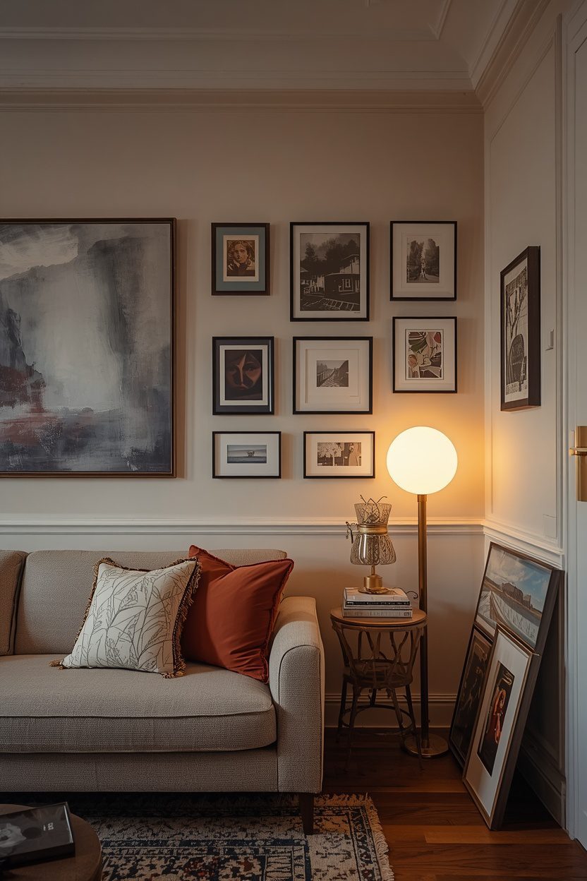
Artwork is the fastest way to give a living room personality, yet it is also where most rooms fall flat. The right pieces, hung at the right height and scale, can transform a space from builder-bland to genuinely yours.
The good news is that displaying art well is far more about a few simple rules than about having an expensive collection. Sizing, spacing, and lighting matter more than price tags.
These 15 living room art ideas cover everything from gallery walls and oversized statements to framing, hanging height, and how to light your pieces. Each comes with the practical measurements designers rely on to get it right the first time.
1. Build a Gallery Wall Above the Sofa
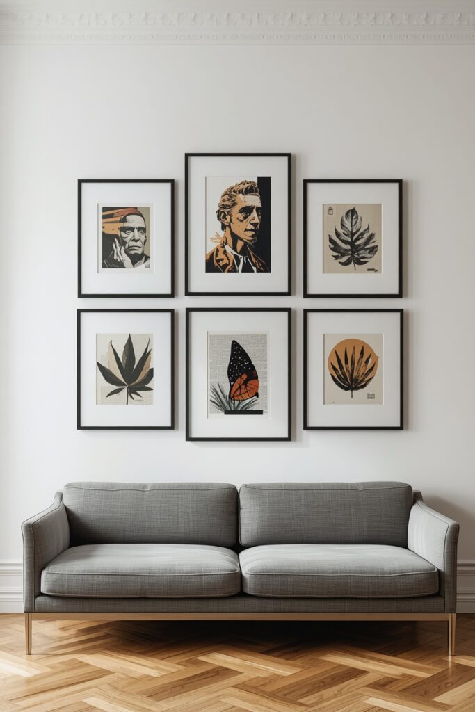
A gallery wall is the most flexible way to fill a large blank wall, and the space above the sofa is the classic spot. It lets you combine pieces of different sizes and subjects into one cohesive display.
Plan it on the floor first. Lay the frames out, shuffle them until the arrangement feels balanced, then trace each one on paper and tape the templates to the wall before you commit to a single nail.
Keep a consistent gap of around 2 to 3 inches between frames so the group reads as one unit rather than scattered pieces. Tighter spacing feels modern and intentional, while large gaps can look accidental.
The whole arrangement should span roughly two-thirds the width of the sofa and start about 8 to 10 inches above the sofa back, so the art and furniture feel connected.
2. Hang One Oversized Statement Piece
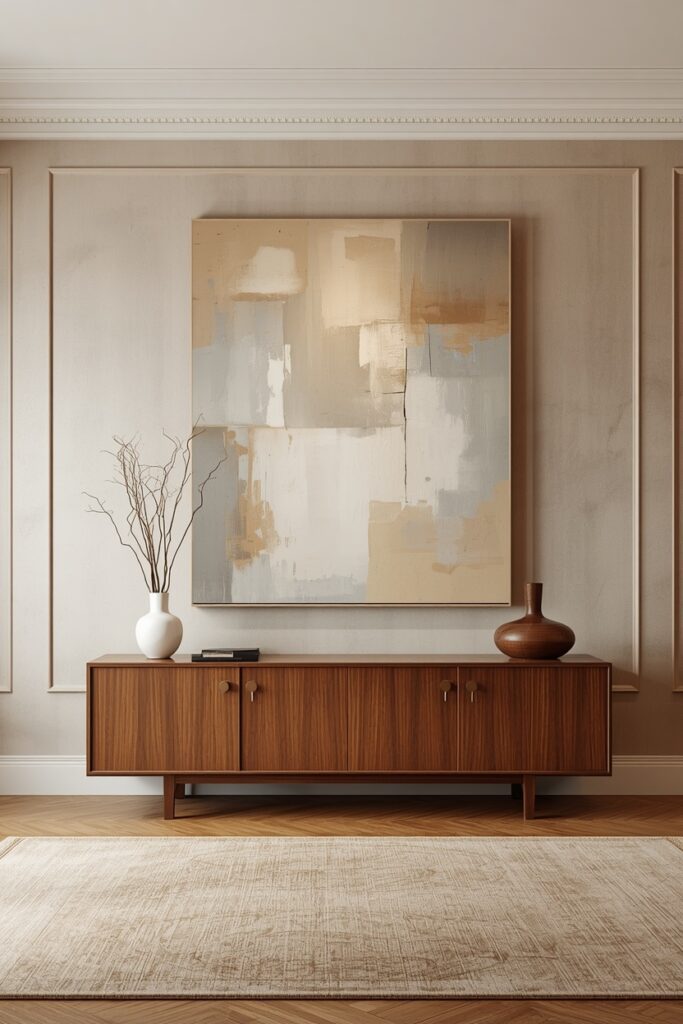
Sometimes one large piece says more than a dozen small ones. An oversized statement artwork brings instant drama and a gallery-like confidence to a living room.
Bigger is almost always better here. A common mistake is hanging art that is too small, which makes the wall feel empty. Aim for a piece roughly two-thirds to three-quarters the width of the furniture below it.
A single large canvas also simplifies a busy room. Where a gallery wall adds energy, one bold piece adds calm, making it a smart choice for spaces that already have plenty going on.
Leave the surrounding wall clear so the piece can breathe. Negative space around a statement work is what makes it feel intentional and expensive rather than crowded.
3. Create a Symmetrical Diptych or Triptych
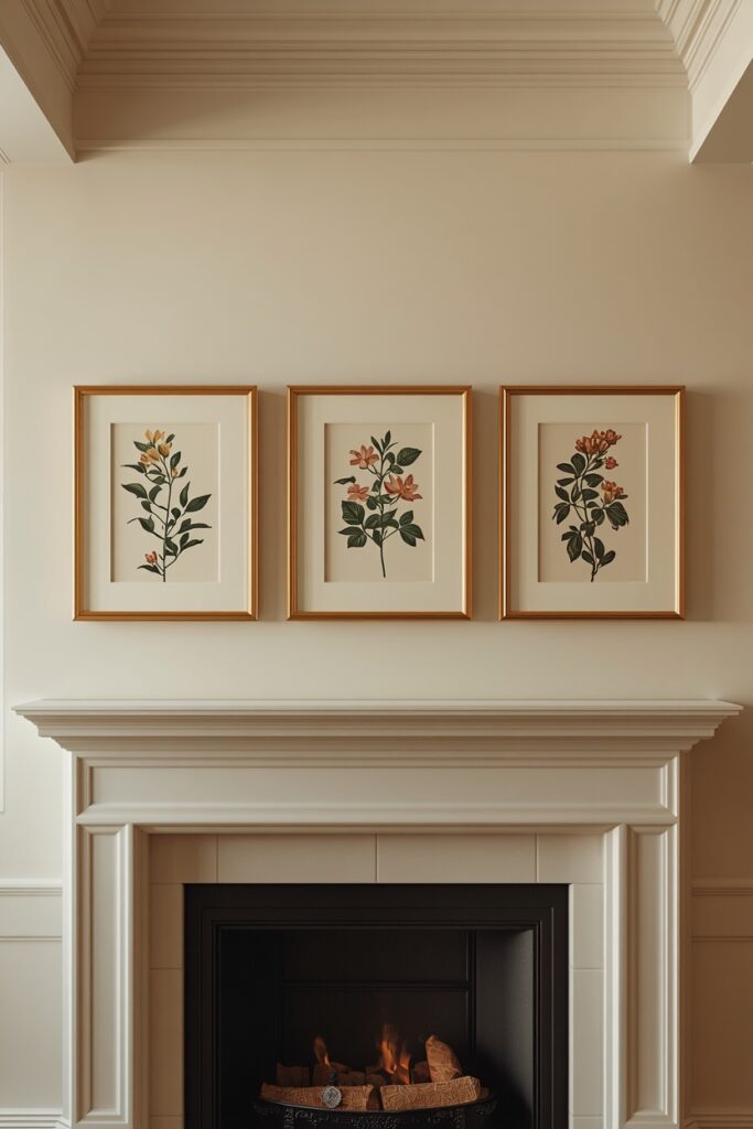
A set of two or three related pieces, known as a diptych or triptych, brings order and rhythm to a wall. It is a foolproof way to fill horizontal space without the planning a gallery wall demands.
Use identical frames and mats so the set reads as one connected work. Subjects that share a theme, such as botanicals, landscapes, or line drawings, reinforce the sense of a deliberate series.
Hang the pieces in a straight line with even gaps, treating the whole group as a single rectangle when you position it on the wall. A level and a tape measure are your friends here.
This approach is especially effective above a sofa, console, or mantel, where its clean symmetry mirrors the lines of the furniture below.
4. Lean Art for a Relaxed, Layered Look
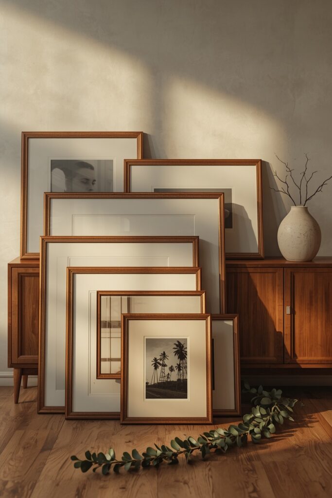
Not all art needs to be hung. Leaning pieces against the wall on a mantel, console, or even the floor creates a relaxed, collected look that feels effortless and current.
Layering is the key technique. Set a larger piece at the back and overlap a smaller one in front, mixing sizes and orientations so the arrangement feels casual rather than staged.
This approach is perfect for renters and the commitment-shy, since nothing is fixed and you can rearrange on a whim. It also suits oversized pieces that would be awkward to hang.
Anchor leaning art so it is stable and safe. Rest larger pieces on the floor against a solid wall, and keep heavier frames away from high-traffic paths where they could be knocked.
Art Sizing Guide for Living Room Walls
| Where It Hangs | Ideal Art Width | Hanging Guidance |
|---|---|---|
| Above a sofa | Two-thirds of sofa width | 8 to 10 in above the back |
| Above a console | Half to two-thirds of console | 4 to 8 in above the top |
| On a blank wall | Fills 60 to 75 percent of wall | Centre at 57 to 60 in |
| Above a mantel | Width of the firebox or wider | 4 to 8 in above the shelf |
| Gallery wall | Spans two-thirds of furniture | 2 to 3 in between frames |
5. Use Picture Ledges for Easy Flexibility
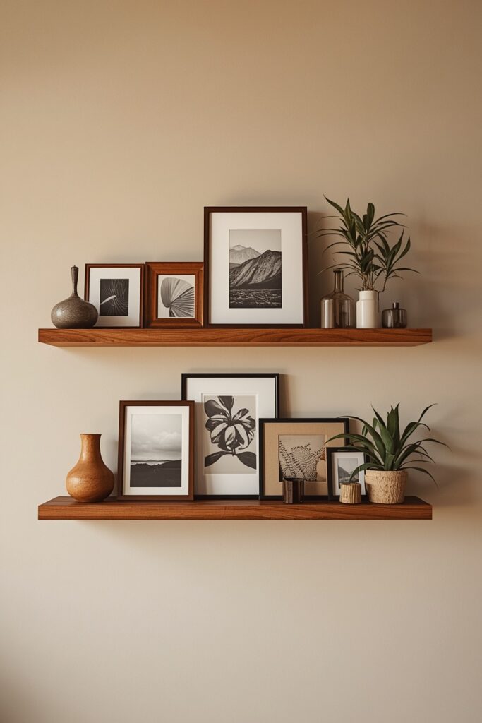
Picture ledges give you all the impact of a gallery wall with none of the permanence. They let you swap, layer, and restyle your art whenever the mood strikes.
Mount two or three ledges in a stack and layer frames front to back along each shelf. Overlapping pieces and mixing in a few small objects keeps the display dynamic rather than rigid.
Because there is only one row of holes to drill per ledge, they are far more forgiving than committing to a fixed gallery layout. It is the ideal solution for indecisive stylists and renters alike.
Vary the size of the frames you display and let some lean while others stand upright. That mix of heights and depths is what gives a ledge its relaxed, designerly feel.
6. Choose Art That Echoes Your Palette
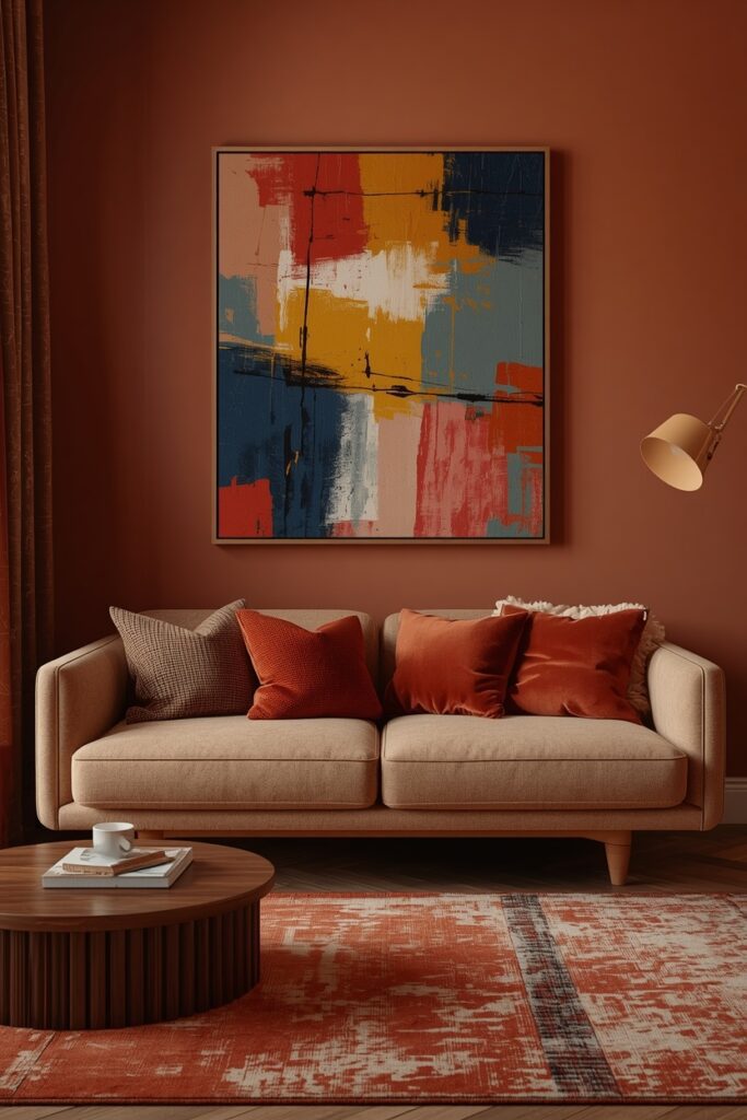
Art that connects to the room’s existing colours instantly looks intentional. Pulling one or two tones from your sofa, rug, or cushions into your artwork ties the whole scheme together.
You do not need an exact match. Echoing a colour family, such as the warm rusts in a rug or the soft blues in your cushions, is enough to create a satisfying visual thread.
Conversely, a single piece in a contrasting accent colour can energise a neutral room. Used sparingly, that pop of colour becomes a deliberate focal point rather than a clash.
If you fall in love with a piece that does not fit your palette, bridge it back into the room with a cushion or accessory in the same shade. That repetition makes it belong.
| ⚠️ Important WarningThe most common art mistake is hanging pieces too high and too small.Art floating near the ceiling, disconnected from the furniture, makes a wall feel awkward and unbalanced.As a rule, the centre of your artwork should sit at 57 to 60 inches from the floor, and above a sofa it should start just 8 to 10 inches above the back.When in doubt, choose a larger piece and hang it lower than feels natural; almost no one regrets art that is too big. |
7. Mix Frame Styles for Characte
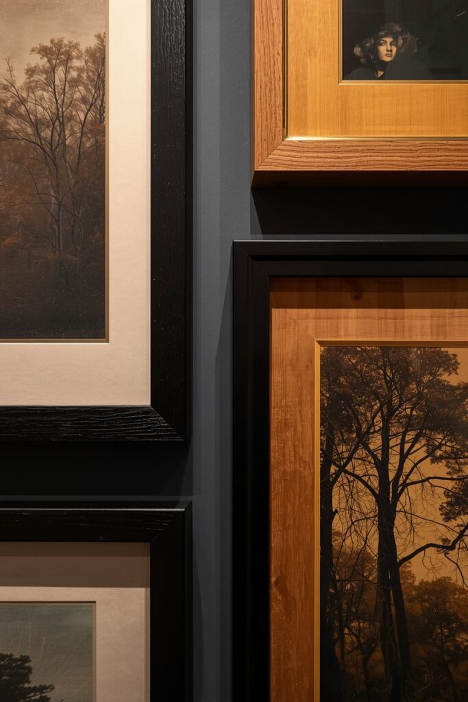
Matching every frame can feel safe but flat. Deliberately mixing frame styles adds collected-over-time character, as long as you give the mix some structure.
Choose a unifying thread to hold the variety together. Consistent matting, a shared colour in the art, or limiting yourself to two or three frame finishes keeps an eclectic mix from looking chaotic.
Warm metals like brass suit traditional and glam rooms, black frames lean modern, and natural wood feels organic and relaxed. Combining two of these creates depth without disorder.
If mixing frames feels risky, start with one varied gallery wall and keep the rest of the room’s art coordinated. That single eclectic moment adds personality without overwhelming the space.
8. Get the Hanging Height Exactly Righ
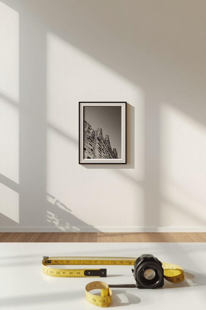
Hanging height is the detail that separates a polished room from an amateur one. Get it right and even modest art looks considered.
The gallery standard is to centre artwork at 57 to 60 inches from the floor, which matches average eye level. This is the same height museums and galleries use, and it works in almost every room.
When art hangs above furniture, the rule shifts slightly: leave 8 to 10 inches between the bottom of the frame and the top of the sofa or console so the two feel related, not disconnected.
To find the nail position, measure the height of the frame, divide by two, then add 57 or 60 to your figure and subtract the distance from the frame top to the hanging wire. Mark, level, and hang.
9. Scale Your Art to the Furniture
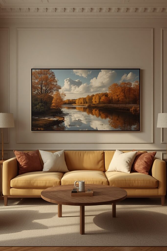
Scale is the single biggest factor in whether art looks right. A beautiful piece in the wrong size will always feel off, no matter how good it is.
The reliable rule is to size art to roughly two-thirds to three-quarters the width of the furniture below it. A 90-inch sofa, for example, suits a piece or arrangement around 60 to 68 inches wide.
If a single piece that size is hard to find, build the width with a diptych, triptych, or gallery grouping. Treat the whole cluster as one shape and apply the same two-thirds rule to it.
On a tall, narrow wall, reach for vertical art or a stacked arrangement instead. Matching the orientation of the art to the shape of the wall keeps everything in proportion.
10. Add Dimension With Textile and 3D Art
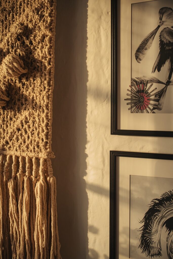
Art does not have to be flat. Woven wall hangings, macrame, baskets, ceramics, and small sculptures bring texture and depth that framed prints alone cannot.
Dimensional pieces are especially valuable in neutral or tonal rooms, where they add interest through shadow and material rather than bold colour. A woven hanging warms up a minimalist wall instantly.
Mix textural pieces into a gallery wall to break up rows of glass-fronted frames. The contrast between a soft textile and a crisp print makes both feel more interesting.
Keep the colours of dimensional art within your palette so the texture, not a clash, is what stands out. Natural fibres in cream, jute, and warm wood tones are the easiest to integrate.
Popular Gallery Wall Layout Styles
| Layout | Look It Creates | Best For |
|---|---|---|
| Grid | Clean and orderly | Matching prints, modern rooms |
| Salon style | Eclectic and full | Large collections, character |
| Horizontal line | Calm and structured | Above sofas and consoles |
| Centre-out cluster | Organic and balanced | Mixed sizes and shapes |
| Two-row stack | Tidy and contained | Narrow or short walls |
11. Light Your Artwork Properly
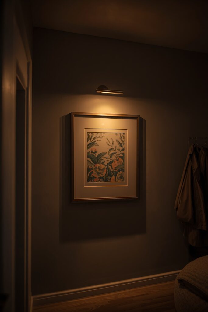
Even the best art falls flat in poor light. Thoughtful lighting turns a piece into a focal point and signals that it matters.
A dedicated picture light mounted above the frame is the most polished option. Size the light to roughly half to two-thirds the width of the artwork, and choose a warm 2700K bulb so colours read true.
If a wired fixture is not practical, battery-operated picture lights and adjustable track or spotlights work beautifully. Angle the beam at about 30 degrees to the art to avoid glare and harsh shadows.
Aim for a high colour rendering index, ideally 90 or above. A high-CRI bulb reveals the full depth of an artwork’s colours, while a cheap bulb can leave it looking muddy and flat.
12. Display Personal Photos With Restraint
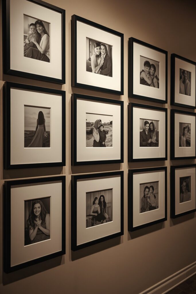
Personal photographs make a living room feel like home, but they look best when displayed with a designer’s discipline. A little structure elevates snapshots into a styled feature.
Converting photos to black and white or a single tone instantly unifies a mismatched collection. Paired with identical frames and generous matting, ordinary photos start to look like gallery prints.
Group photos together in one considered arrangement rather than scattering them across the room. A dedicated photo wall or a cluster on a single shelf feels intentional, not haphazard.
Keep the most personal images to one area and let art lead elsewhere. That balance stops the living room from feeling like a busy family corridor.
13. Try Large Prints and Posters on a Budget
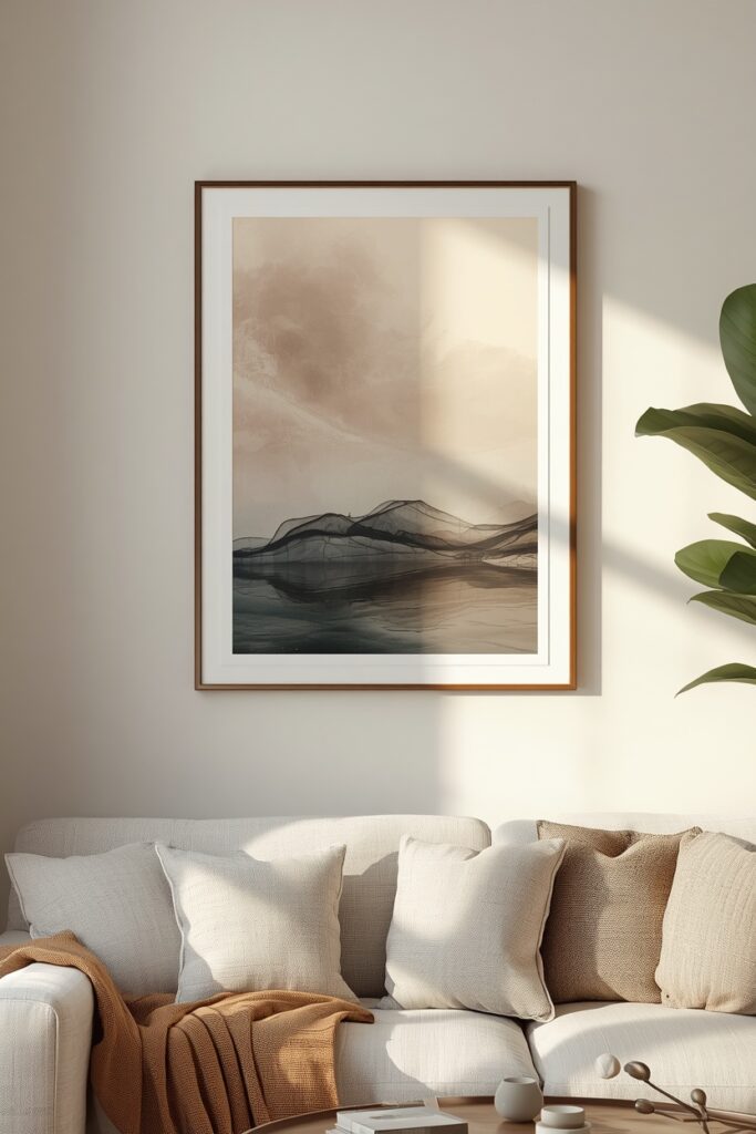
Filling a living room with art does not require a big budget. Large-format prints, posters, and digital downloads deliver serious impact for very little money.
Affordable print shops and online marketplaces sell huge engineer prints and poster-size art for the price of a coffee. A simple frame, or even a poster hanger, makes them look far more expensive than they are.
Open-source museum archives and free download sites offer high-resolution classic artworks you can print at home or through a local shop. Vintage botanicals and maps are particularly effective at scale.
The trick with budget art is to spend on the frame and the scale rather than the print itself. A good frame and a generous size make even an inexpensive print read as intentional.
14. Use Mirrors as Sculptural Art
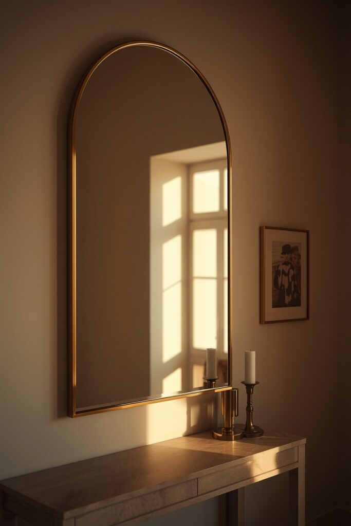
A beautiful mirror works as art in its own right while doing the practical job of bouncing light around the room. In darker or smaller living rooms, it earns its place twice over.
Choose a mirror with a sculptural shape or a striking frame, such as an arched, sunburst, or organic form. Treated as a focal piece, it brings the same presence as a large artwork.
Position a mirror to reflect something worth seeing, like a window, a plant, or a chandelier. A mirror that simply faces a blank wall adds light but misses its full decorative potential.
Mix mirrors into a gallery wall for variety, but use them sparingly. One or two reflective surfaces add sparkle, while too many can make a wall feel busy and disorienting.
15. Curate a Cohesive, Collected Loo
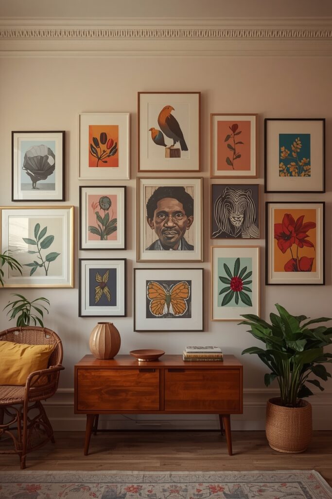
The most compelling living room art feels gathered over time rather than bought in one trip. Curating with a loose theme is how you achieve that collected, personal look.
Choose a unifying thread and let everything else vary. It might be a colour, a subject, an era, or simply a consistent frame finish. That single common element holds an eclectic mix together.
Buy pieces you genuinely love rather than filling space for the sake of it. Art chosen with real feeling always reads as more authentic, and a half-finished wall you love beats a full one you do not.
Give yourself permission to evolve the display. Swap pieces in and out as your taste grows, and treat the walls as a living collection rather than a finished, untouchable arrangement.
| ⭐ Pro TipBefore putting a single hole in the wall, cut paper or newspaper to the size of each frame and tape the templates up.Step back, photograph the layout, and adjust the spacing and height until the balance looks right.Only then mark your nail points through the paper, so every hole lands exactly where you want it.This five-minute habit prevents a wall full of unnecessary holes and second-guessing. |
| 📌 Important NoteThere is no single correct way to display art, and personal taste should always lead.The sizing and height rules in this guide are reliable starting points, not rigid laws.Once you understand the principles of scale, spacing, and light, you can break them with confidence to suit your own space and style. |
Your Living Room Art Checklist
Run through this checklist before you hang to get gallery-worthy results every time:
- Size art to roughly two-thirds the width of the furniture below it.
- Centre pieces at 57 to 60 inches, or 8 to 10 inches above a sofa back.
- Keep 2 to 3 inches of even spacing between gallery frames.
- Plan the layout on the floor or with paper templates first.
- Echo one or two of the room’s existing colours in your art.
- Light key pieces with a warm 2700K, high-CRI fixture.
- Choose a unifying thread to hold a varied collection together.
Frequently Asked Questions
How high should I hang art in my living room?
Centre artwork at 57 to 60 inches from the floor, which matches average eye level and gallery standard. When hanging above a sofa or console, leave 8 to 10 inches between the bottom of the frame and the furniture so they feel connected.
What size art should go above a sofa?
Choose art, or a grouping, about two-thirds to three-quarters the width of the sofa. For a standard 84 to 90 inch sofa, that means a piece or cluster roughly 56 to 68 inches wide.
How do I arrange a gallery wall?
Lay the frames on the floor and rearrange until balanced, keeping 2 to 3 inches between pieces. Trace each frame onto paper, tape the templates to the wall to test the layout, then hang from the centre outward.
Can I mix different frame styles?
Yes, mixing frames adds character as long as there is a unifying thread. Limit yourself to two or three finishes, or use consistent matting and a shared colour, so the variety still feels cohesive.
How do I choose art that suits my living room?
Pick pieces you love, then connect them to the room by echoing one or two existing colours from your sofa, rug, or cushions. Match the orientation of the art to the wall, and prioritise the right scale over the subject.
Final Thoughts
Great living room art is less about a big budget and more about a few reliable rules: the right scale, the right height, considered spacing, and good lighting. Master those and almost any piece will look intentional.
Whether you build a layered gallery wall, hang one bold statement, or lean a relaxed collection on a ledge, let the room’s palette and proportions guide you. The furniture and the art should always feel like partners.
Most of all, choose pieces that mean something to you. A wall filled with art you genuinely love will always feel warmer and more personal than one assembled simply to fill the space.