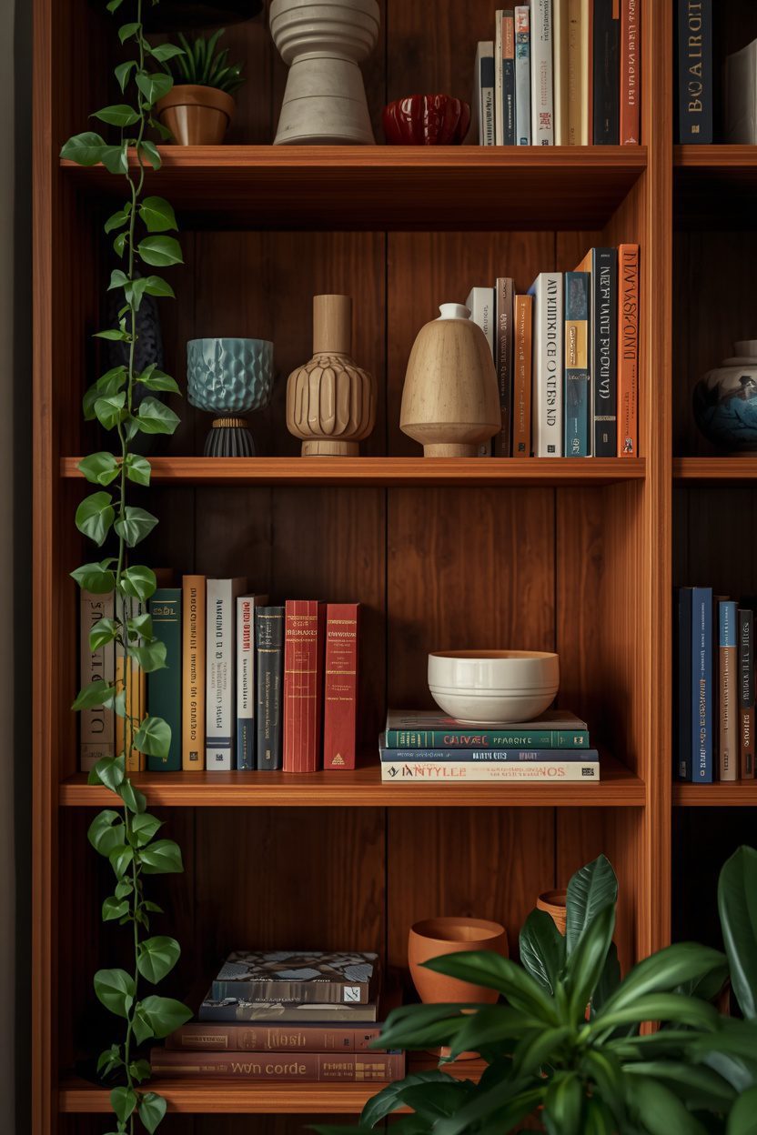
The difference between a bookshelf that looks styled — and the reason most bookshelf styling ideas exist — and one that looks stuffed comes down to three principles: leave empty space, vary the heights, and group objects in odd numbers. Every bookshelf styling idea in this guide builds on those rules — and every one can be applied to any shelf, whether it is a floor-to-ceiling built-in, a modular cube unit, or a single floating shelf in a hallway.
Each of the 13 ideas below is a complete styling approach: it tells you what to place, how to arrange it, and how much of the shelf to leave empty. I have included honest notes on which approaches suit book-heavy collections versus display-heavy shelves, because a library wall needs a different treatment than a living-room étagère. Start with the approach closest to your shelf size and object inventory.
1. Colour-Grouped Book Arrangement
Grouping books by spine colour — rather than by author or genre — turns a bookshelf into a visual gradient that reads as designed from across the room. Sort your collection into colour families (whites and creams, blues, greens, reds, browns, blacks) and arrange each group on a separate shelf or section. Within each group, alternate between vertical stacks and horizontal piles to vary the silhouette. Leave 20–30 percent of each shelf empty and fill the gap with one object in a complementary tone: a ceramic vase, a small plant, or a framed photograph. The colour-grouped approach suits collections of 50 books or more where the spine colours provide enough variety to create visible bands.
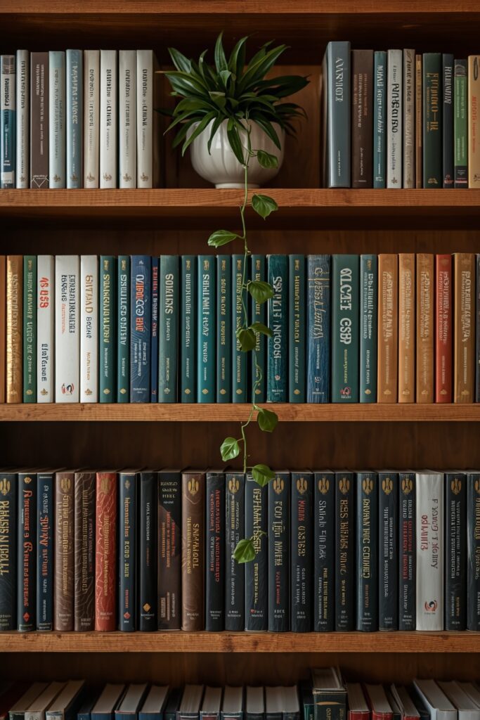
For smaller collections, mix colour-grouped books with decorative objects to fill the shelves without needing more books. One caveat: this arrangement sacrifices the ability to find a specific book by author — use it on display shelves, not on a working reference library.
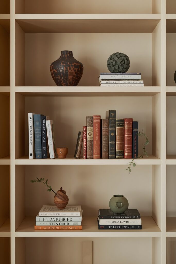
2. Books and Objects in the Rule of Odds
The rule of odds — styling objects in groups of one, three, or five — creates visual compositions that the eye finds more dynamic than even-numbered groups. On each shelf, create one grouping: three books stacked horizontally with a ceramic object on top, or five items arranged at varying heights (two books vertical, one book horizontal, one vase, one small sculpture). The odd-numbered group creates a natural focal point and avoids the static symmetry that even groups produce. Space the groupings so each shelf has a clear anchor zone and a clear empty zone — roughly 60 percent styled and 40 percent open.
The objects should vary in material: a glazed ceramic, a natural wood piece, a metal object, and a living plant bring textural variety. Keep the colour palette to three tones that run through every shelf so the bookcase reads as one composition rather than a collection of unrelated vignettes.
3. Horizontal and Vertical Book Mix
Alternating between vertically shelved books (spines out, standing upright) and horizontally stacked books (spines facing out, piled flat) creates a rhythm that breaks up the uniform vertical line of a traditional bookshelf. Use horizontal stacks as pedestals: stack three or four books flat and place a small object on top — a candle, a ceramic, a framed photo leaning against the back of the shelf.
The vertical section beside it holds five to eight books standing upright, supported by a bookend or leaning against the horizontal stack. Alternate this pattern across the shelf — vertical group, horizontal stack with object, vertical group — so the eye moves in a gentle wave.
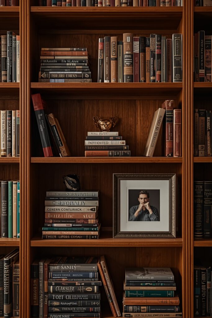
The horizontal stacks also allow you to display book covers rather than spines, which is useful for beautiful coffee-table books or art monographs that deserve face-forward display.
4. Bookshelf Styling Ideas With Plants and Greenery
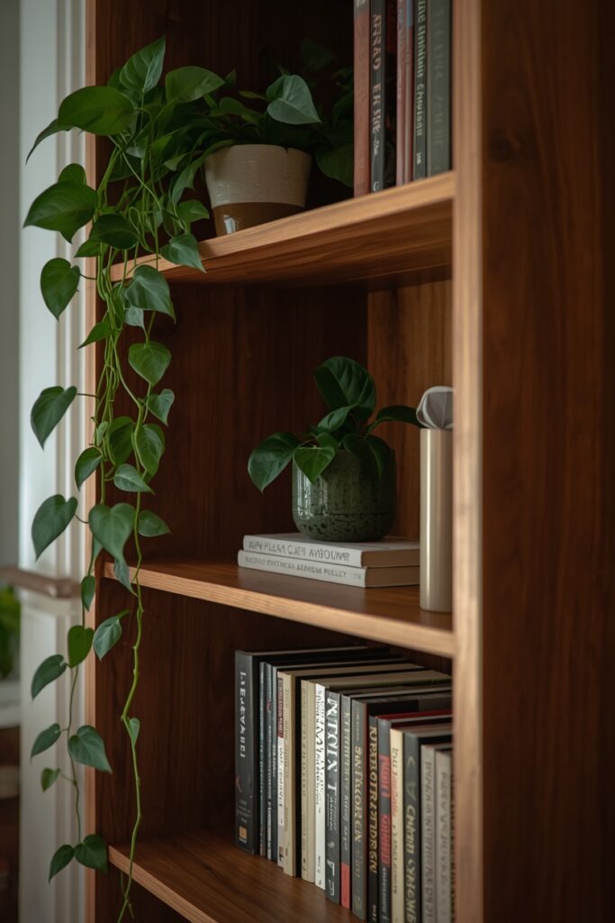
Plants on a bookshelf — trailing, upright, or tucked between book groups — add the one element that no amount of ceramics or art can replicate: living, changing, organic softness. Use trailing plants (pothos, string of pearls, philodendron) on upper shelves so the vines cascade down the front of the bookcase. Place upright plants (small snake plant, ZZ plant, or a succulent cluster) on middle shelves between book groupings. A single larger plant in a ceramic pot on a lower shelf or on top of the bookcase anchors the greenery from a different height. Limit the plants to two or three per bookcase — more than that and the shelves read as a plant stand rather than a styled bookshelf. Choose planters in the same material family as your other shelf objects (all ceramic, all concrete, or all terracotta) for cohesion. One practical note: trailing plants near books can drip when watered — water them at the sink and let them drain before returning to the shelf.
5. Minimal Shelf With Maximum Negative Space
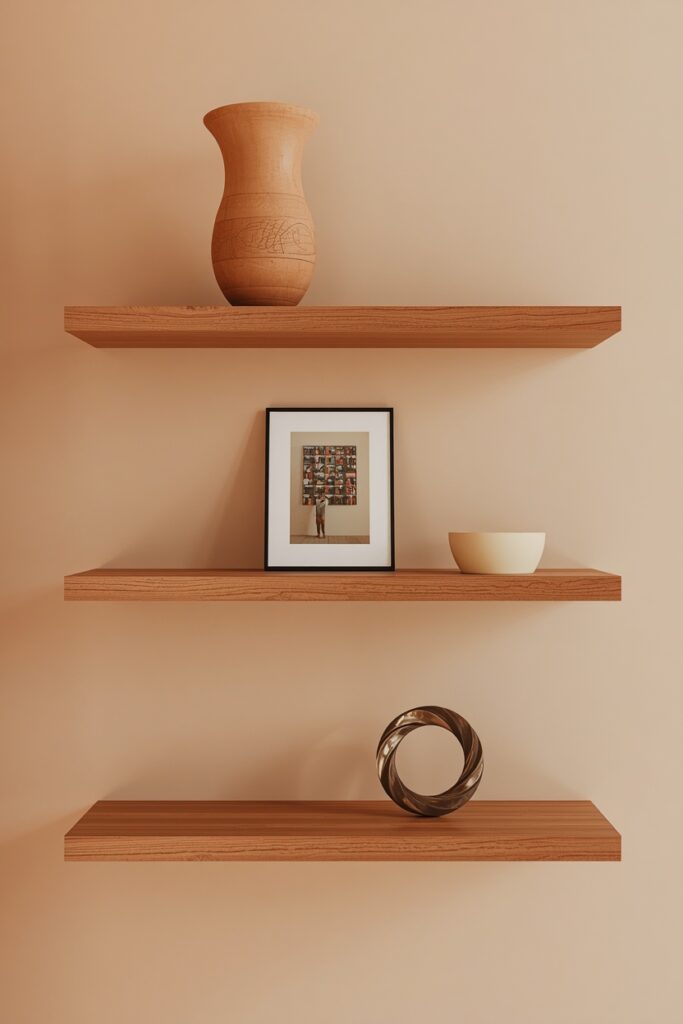
A minimally styled shelf — one object per shelf, or one tight grouping surrounded by generous empty space — creates a gallery-like presence that draws attention to each item. This approach suits floating shelves, modular cube units, and built-in shelving where the shelf itself is part of the room’s architecture. Choose one object per shelf: a ceramic vase, a single leaning print, a small sculpture, a stack of three books with an object on top. The empty space around the object is not wasted — it is what gives the object visual importance. This style requires restraint: every additional item dilutes the impact.
Use it in living rooms, bedrooms, and hallways where the shelves serve as display rather than storage. For book lovers who want this look, keep the main book collection in a separate closed storage or a dedicated library zone, and curate only the most visually striking volumes for the display shelf.
Image prompt:
6. Neutral-Palette Shelf Styling
Restricting the shelf palette to neutrals — cream, white, natural wood, soft gray, matte black — creates a calm, cohesive display that suits modern and Scandinavian interiors. Turn any brightly coloured book spines backward (pages facing out) so only the neutral page edges show, or wrap dust jackets in brown kraft paper for a uniform tone. Decorative objects should follow the same rule: white ceramic, natural wood carvings, stone pieces, and clear glass.
A single plant in a neutral pot provides the only organic colour. The result is a bookshelf that reads as a textural composition in one tonal family — soothing rather than stimulating. This approach suits rooms where the bookshelf should recede into the background rather than serve as the focal point.
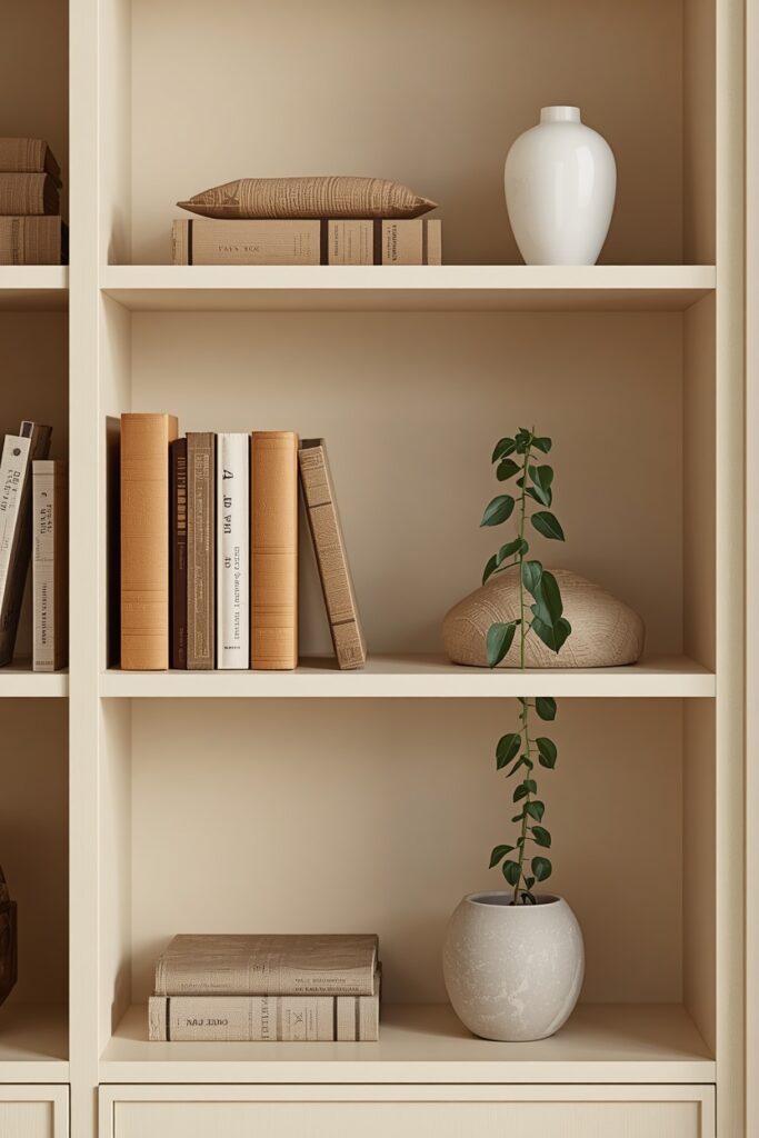
The trade-off is legibility: backward-turned books and kraft-wrapped covers make finding specific titles harder, so reserve this treatment for display shelves rather than working libraries.
7. Art-Leaning Shelf Arrangement
Leaning small framed prints, postcards, or photographs against the back of the shelf — rather than hanging them on the wall — adds a casual, gallery-owner quality to the bookshelf. Place one to two leaning pieces per shelf, behind a short stack of horizontal books or beside a vertical book group. The frames should be thin and consistent: all black, all natural wood, or all thin brass. The content can be anything — botanical prints, architectural photography, vintage postcards, personal photographs — as long as the frame size stays small enough to sit comfortably on the shelf depth (25–35 cm deep shelves accommodate frames up to roughly 20 × 25 cm). Overlap frames slightly for a layered look, or space them apart for a cleaner one.
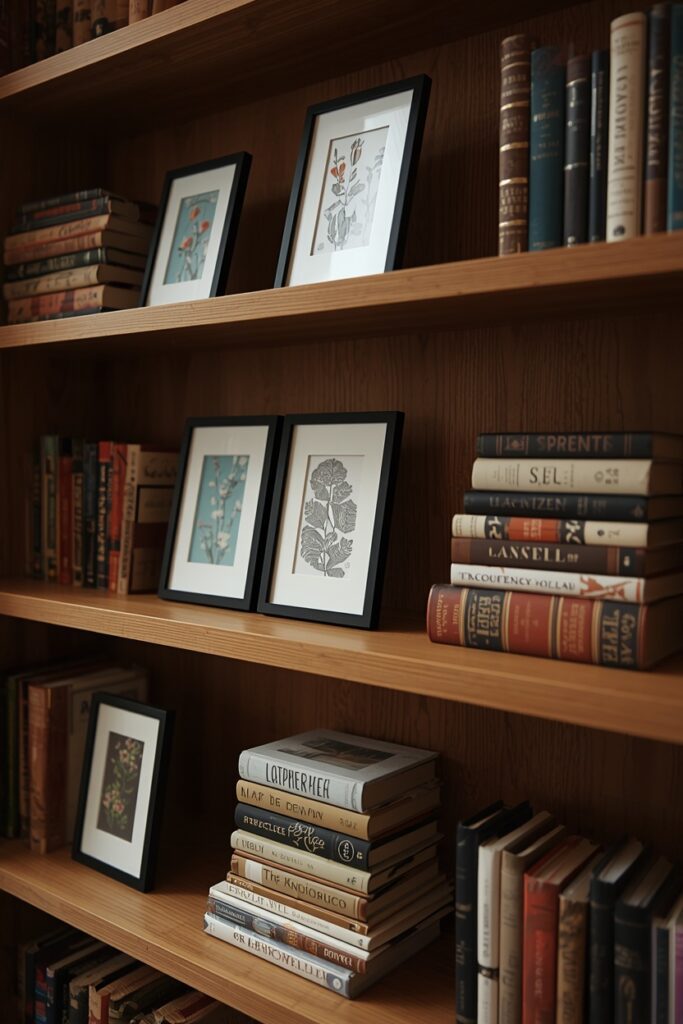
This approach is endlessly changeable: swap prints seasonally, rotate personal photographs, or add a new postcard from every trip. No hammer, no nails, no wall damage.
8. Bookshelf With Woven Baskets for Hidden Storage
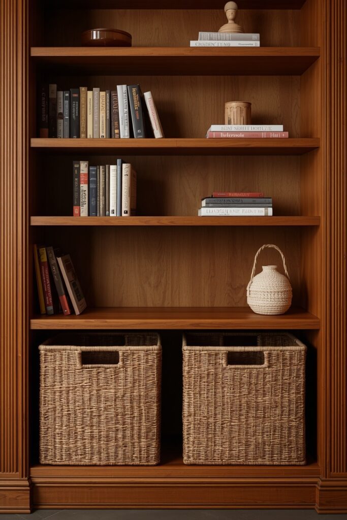
Woven baskets — seagrass, rattan, cotton rope, or jute — placed on lower or middle shelves provide hidden storage for items that do not belong on display: remote controls, charging cables, small toys, stationery, or magazines. Choose baskets that fit the shelf height with a few centimetres of clearance above and match them in material and colour for a cohesive look. Two or three matching baskets across the bottom shelves ground the bookcase visually while keeping the upper display shelves clean and curated. The baskets themselves become decorative objects when the material is interesting — a woven seagrass texture reads as warm and organic against the straight lines of the shelf. This hybrid approach (styled upper shelves, basket-storage lower shelves) is the most practical bookshelf styling for living rooms and family spaces where daily-use items need a home that stays tidy.
9. Bookshelf Styling Ideas With a Collected Travel Theme
Souvenirs, artefacts, and objects collected from travel — a ceramic bowl from Morocco, a wooden figure from Bali, a woven textile from Peru, a stone from a Greek beach — bring a personal, storied quality to a bookshelf that purchased decor cannot replicate. Arrange travel objects between book groupings, treating each shelf as a small vignette from a different memory or trip. Include travel photography (framed snapshots or postcards leaned against the shelf back) to anchor the objects in their story. The binding thread is the bookshelf itself and a shared earthy palette — most handmade travel objects share warm, natural tones that coexist peacefully.
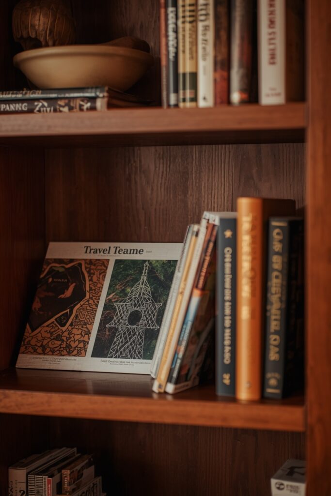
Leave negative space so each object has room to breathe and read as a chosen piece rather than a crowded souvenir display. This bookshelf tells a life story — it gets richer with every trip and cannot be replicated by anyone else.
10. Symmetrical Shelf Styling for Formal Rooms
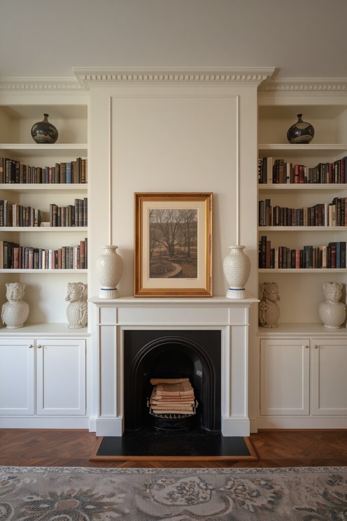
Symmetrical arrangement — mirroring the same object types on each side of a central axis — creates a balanced, formal display that suits traditional living rooms, studies, and home offices. Place identical objects (matching vases, matching bookends, matching frames) at the left and right ends of each shelf, with a central grouping of books between them. The repetition creates order that the eye finds restful and polished. Use an even number of shelves for the strongest symmetry, and keep the colour palette to two or three tones.
The objects do not need to be genuinely identical — two ceramic vases of similar size and colour read as a pair even if one is round and the other cylindrical. This approach suits built-in shelving flanking a fireplace or framing a window, where the architectural symmetry of the shelving demands a matching arrangement.
11. Shelf Styling With One Bold Accent Colour
Introducing a single accent colour — a consistent hue that appears on two or three objects across the bookshelf — ties the entire display together and gives the eye a path to follow. Choose a colour that complements your room: a deep blue ceramic vase on one shelf, a blue book cover on another, and a blue candle on a third creates a visual thread that connects the shelves without overwhelming them.
The remaining objects and books stay in neutrals (cream, white, wood, black) so the accent colour pops. This approach provides more colour energy than a fully neutral shelf without the visual noise of a rainbow arrangement.
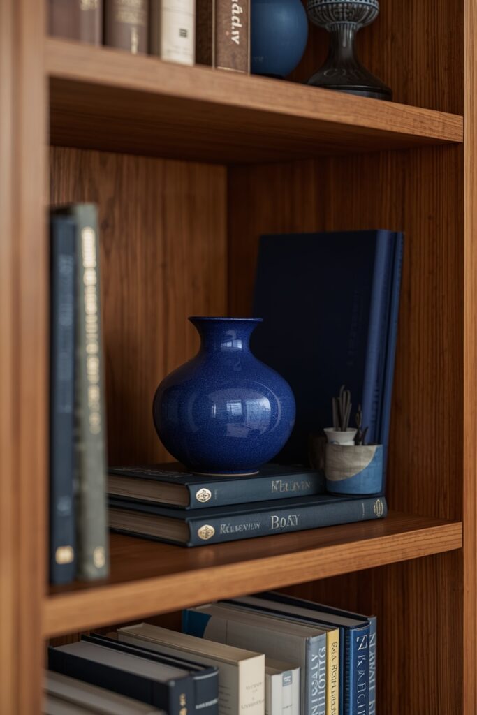
Rotate the accent colour seasonally — warm rust in autumn, soft blue in summer, deep green in winter — for a low-effort shelf refresh that changes the room’s mood with three swapped objects.
12. Coffee-Table Book Display on Shelves
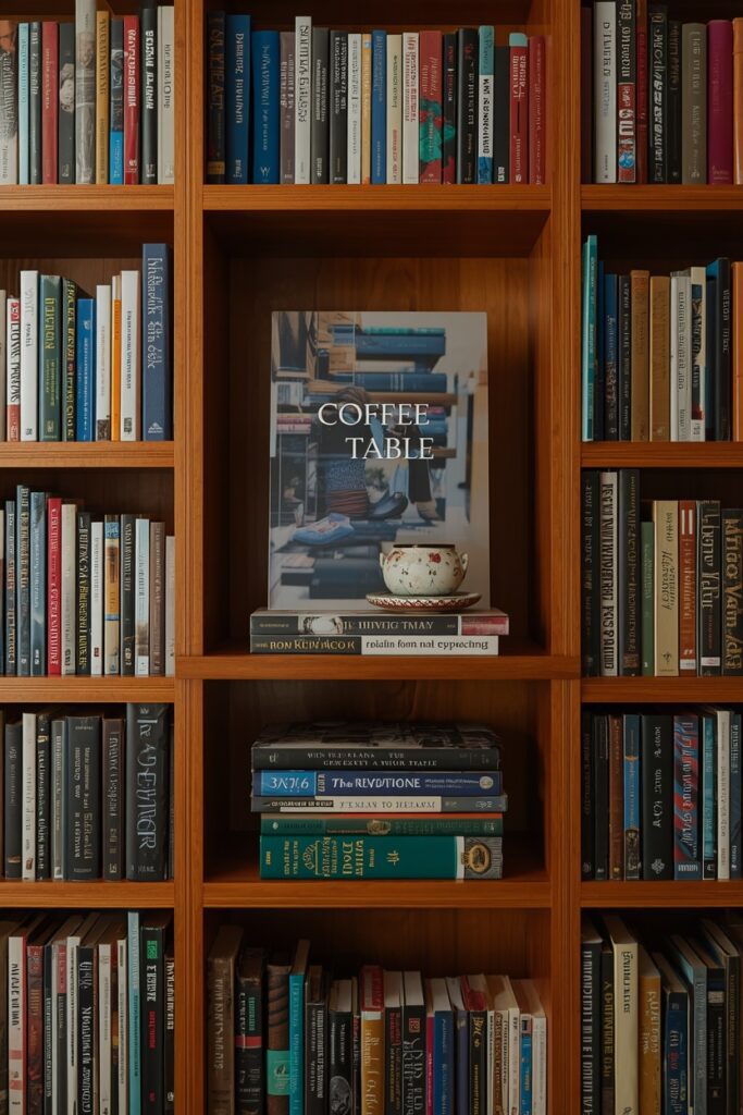
Large-format coffee-table books — art, photography, design, travel — serve as both decor and reading material when displayed face-forward or in prominent horizontal stacks on a bookshelf. Lean one oversized book face-forward on a shelf, propped against the back panel so the cover serves as artwork. Stack two or three more horizontally on the shelf below with a small object on top — a ceramic, a candle, or a small framed print. The face-forward technique turns the most beautiful cover in your collection into a rotating display piece. Alternate shelves between face-forward books and traditional spine-out arrangement so the bookcase varies in rhythm. This approach suits living-room shelves, reading nook shelving, and home-office bookcases. The books should be genuine favourites — a face-forward book you have never opened reads as decoration rather than curation, which undermines the personal quality that makes a bookshelf interesting.
13. Bookshelf Styling Ideas for a Full Library Wall
A floor-to-ceiling library wall — shelves packed with books from bottom to top — is a design statement in itself, and the styling approach differs from a display-focused bookshelf. Fill every shelf with books, but vary the arrangement: some shelves packed tightly spine-out, others with a gap for a single object (a vase, a small framed photo, a brass clock). Alternate between tall and short book groupings to create a varied skyline along the top edges. Reserve one or two shelves for a horizontal stack with a trailing plant or a piece of art leaned against the back. The colour cohesion comes from the books themselves — a full library wall has enough natural colour variation that it reads rich without any organising strategy.
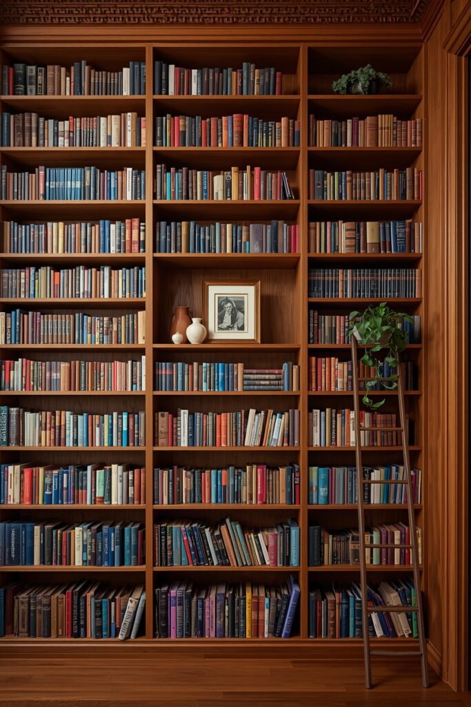
A library ladder (rolling or hook-mounted) adds function and architectural character. This approach suits dedicated reading rooms, home offices, and living rooms where books are the primary decorative element.
Where I’d Start if I Only Did Three Things
If I only did three things, I would start by removing about a third of what is currently on the shelves — negative space is the single ingredient that separates a styled bookshelf from a cluttered one. Second, I would choose three colours (pulled from the room’s palette) and limit every object and visible book spine on the shelf to those three tones, removing or turning around anything that clashes. Third, I would add one trailing plant on an upper shelf, because a single living element softens an entire bookcase of hard surfaces.
Frequently Asked Questions
What bookshelf styling ideas work for people who own lots of books?
Fill the shelves with books but vary the arrangement: some sections packed tightly, others with gaps for a single decorative object. Alternate between vertical and horizontal stacks, and reserve one or two shelves for face-forward coffee-table books. The books themselves become the decor when the arrangement has rhythm and breathing room.
How much of a bookshelf should be empty?
Roughly 20 to 40 percent empty space is the range that reads styled without looking bare. Display-focused shelves lean toward 40 percent; book-heavy shelves lean toward 20 percent. The empty space should be distributed across the bookcase — one gap per shelf — rather than concentrated on one empty shelf.
Should books be arranged by colour or by subject?
By colour for display-focused shelves where the visual impact matters more than findability. By subject or author for working reference libraries where you need to locate specific titles quickly. A middle ground: group by subject within rough colour zones so the shelf reads both organised and visually coherent.
What objects look best on a bookshelf besides books?
Ceramic vases, small sculptures, framed photographs, trailing plants, candles, woven baskets (for hidden storage), and one or two personal objects (a travel souvenir, a meaningful gift). Vary the material — ceramic, wood, metal, glass, plant — so the shelf has textural variety. Keep each object in the room’s colour palette for cohesion.
Final Thoughts
The best bookshelf styling ideas treat the shelf as a composition — not a storage unit. Remove enough to create breathing room, vary the heights and orientations, group objects in odd numbers, and run a consistent colour palette through every shelf. A bookshelf styled with these principles reads as intentional and inviting, whether it holds 20 books or 200.