
An accent wall is the single fastest way to change a room’s character — one surface, one treatment, and the entire space shifts from neutral to intentional. But the wrong accent wall (the wrong colour, the wrong wall, or the wrong material) draws attention to itself for all the wrong reasons and makes the room feel disjointed rather than designed. These 16 accent wall ideas cover the full range of treatments — paint, wood, tile, wallpaper, plaster, and more — and each one specifies which wall to choose, which rooms it suits, and how to coordinate the surrounding surfaces.
The golden rule is simple: the accent wall should be the first surface your eye finds when you enter the room. That is usually the wall opposite the doorway, the wall behind the bed, or the wall that frames the fireplace. If you have to explain where the accent wall is, you have chosen the wrong one.
1. Deep Saturated Paint in a Single Bold Colour
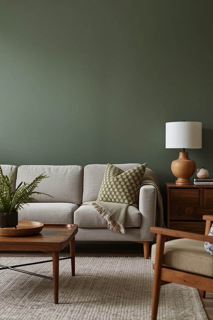
A single wall painted in a deep, saturated colour — forest green, navy, charcoal, burgundy, or terracotta — creates the most accessible accent wall because it requires nothing beyond paint and a roller. Choose the wall that anchors the room’s primary furniture: behind the sofa, behind the bed, or behind the dining table. The surrounding three walls should stay in a warm white or the palest version of the accent colour so the bold wall leads without competition. Use an eggshell or satin sheen on the accent wall to catch light with subtle depth, and a matching or slightly flatter sheen on the adjacent walls.
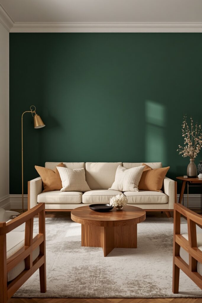
Test a 30 × 30 cm swatch under both daylight and evening light before committing — saturated colours shift dramatically between 2700K lamplight and natural sun. One coat of tinted primer followed by two topcoats gives the most even coverage on deep tones.
2. Vertical Wood Slat Panel Wall
Vertical wood slats — narrow strips (20–40 mm wide) mounted with even gaps on a backing board — create a textured, architectural accent wall that catches light and shadow throughout the day. Use slats in natural oak, walnut, or pine, sealed with a clear coat. Mount them on a plywood or MDF backing painted in a matching or contrasting colour (black behind light wood, or white behind dark wood). The gap between slats is typically 20–30 mm and determines how much backing colour shows through.
Install the panel on the wall behind the bed, behind the TV, or behind the dining table. This treatment suits modern, Japandi, and Scandinavian interiors.
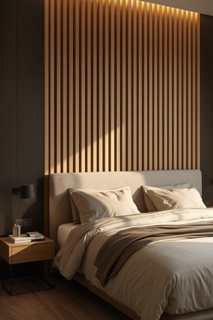
The slats can be DIY-cut from timber strips or purchased as pre-made panels that mount as a single unit. One maintenance note: the gaps between slats collect dust — a vacuum with a brush attachment or a compressed-air duster handles this easily every few weeks.
3. Large-Scale Botanical Wallpaper
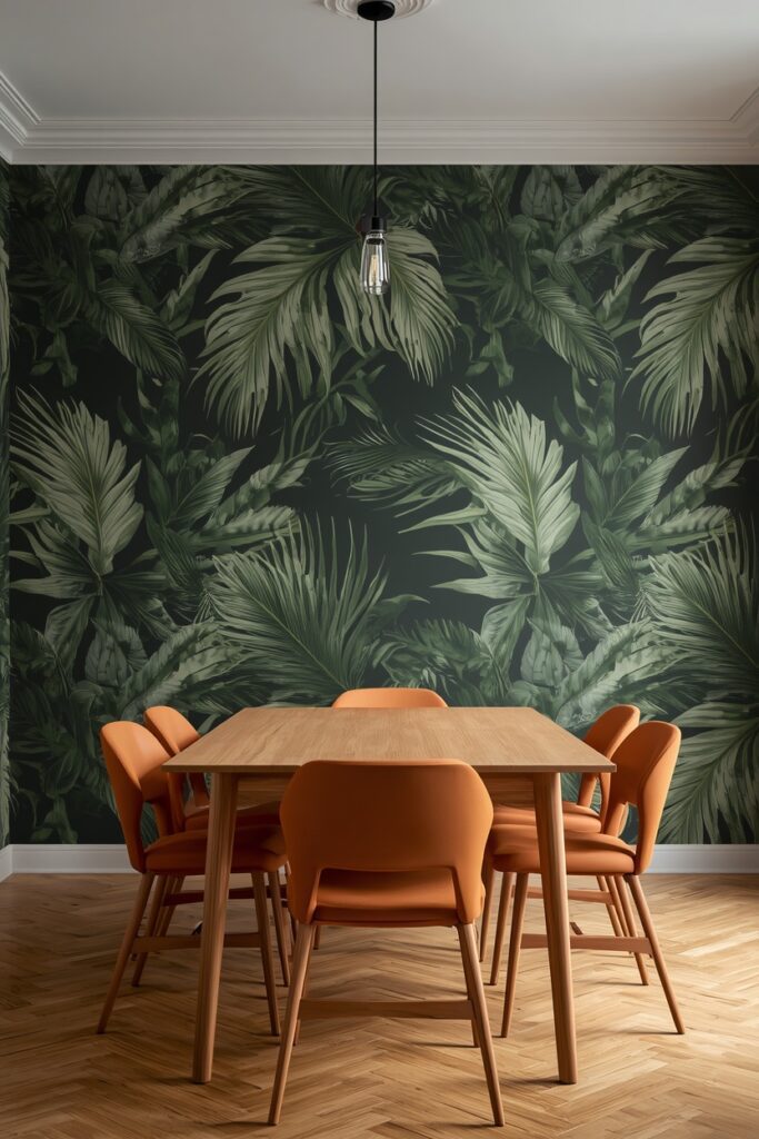
A large-scale botanical wallpaper — oversized leaves, ferns, tropical flowers, or trailing branches — turns a wall into a living mural without any actual plants. Choose a design with a dark background (charcoal, navy, deep green) for drama or a light background (cream, pale blush, soft gray) for airiness. Apply it on a single wall — the wall you face when entering the room — and keep all other walls in a solid colour pulled from the wallpaper’s palette. Furniture against the wallpapered wall should be simple and solid-coloured so the pattern breathes. This treatment suits bedrooms, dining rooms, powder rooms, and living rooms. Peel-and-stick wallpaper offers a renter-friendly option that removes cleanly, though it lasts 2–3 years versus a pasted paper’s decade-plus. In a powder room (the smallest wall area), even a premium wallpaper is affordable, and the impact per square metre is the highest in the home.
4. Board-and-Batten Panelling
Board-and-batten — vertical strips (battens) mounted over a flat board background at regular intervals — adds classic architectural texture to a plain wall. The battens are typically 50–75 mm wide, spaced 30–40 cm apart, and run from the floor to the ceiling or from the floor to chair-rail height (90–100 cm). Paint the entire treatment in one colour: white for cottage and coastal rooms, sage or navy for a modern take, or the same colour as the adjacent walls for a tone-on-tone texture effect. This treatment suits bedrooms (behind the headboard), dining rooms (on the wall behind the table), and living rooms (behind the sofa or fireplace). The materials — MDF battens and a flat backing — cost very little, and the installation is DIY-friendly with a nail gun, construction adhesive, and a level.
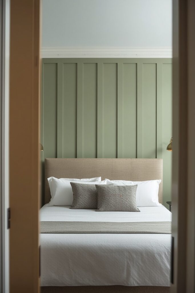
Fill nail holes, caulk the edges, and apply two coats of paint for a professional result. Board-and-batten adds architectural interest to rooms that lack crown moulding, wainscoting, or other built-in character.
5. Accent Wall Ideas With Limewash Paint
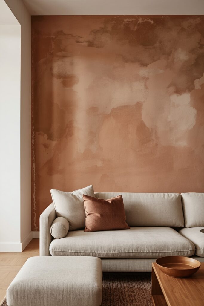
Limewash paint creates a soft, chalky, cloud-like texture on a wall that no standard paint can replicate — the colour varies subtly across the surface, lighter in some areas and deeper in others, producing a plaster-like depth. Apply limewash with a large brush in overlapping, irregular strokes rather than a roller — the brush marks are the texture. Choose a warm tone: pale plaster pink, soft terracotta, warm white, or sandy beige. Limewash suits the wall behind the bed, behind the sofa, or in a dining room as a backdrop for candlelit evenings. The surrounding walls should be painted in a flat warm white so the limewash reads as the room’s single textural event.
Limewash is breathable and naturally antimicrobial, making it suitable for bedrooms and living spaces. One trade-off: limewash marks easily and is not washable in the way that eggshell or satin paints are — avoid it in high-touch areas or homes with young children.
6. Reclaimed Wood Plank Wall
Reclaimed wood planks — salvaged barn wood, pallet wood, or aged timber — mounted horizontally across a wall bring warmth, texture, and a history that new materials cannot replicate. The colour variation from plank to plank — gray, brown, honey, weathered white — creates a patchwork effect that reads rich without any paint or stain. Mount the planks on a cleat system or directly onto the wall with construction adhesive and finish nails.
Sand any rough splinters and apply a clear matte sealant to protect against dust accumulation. This treatment suits bedrooms (behind the headboard), living rooms (behind the TV or fireplace), and dining rooms. Pair with simple, modern furniture — the wood wall provides enough visual complexity that the surrounding pieces can stay quiet.
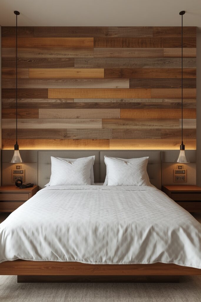
One practical note: source reclaimed wood from a reputable supplier who has kiln-dried it to eliminate insects and mould — untreated salvaged wood can harbour pests if not properly prepared.
7. Geometric Painted Mural
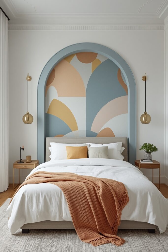
A geometric mural — arches, colour blocks, stripes, or abstract shapes — painted directly onto the wall creates a custom accent that requires nothing more than painter’s tape, a few paint colours, and patience. Popular designs include a single oversized arch in a muted colour (soft sage, dusty blue, warm clay) framing the bed or a reading nook, or a series of horizontal colour blocks stacked from dark at the bottom to light at the top. Map the design on the wall with a pencil and painter’s tape before painting, and use a small foam roller for smooth, even coverage within each shape. Two to three colours from the same family (a dark, a mid-tone, and a light) create depth without chaos. This approach costs almost nothing — a few paint samples cover most designs — and produces a one-of-a-kind wall that no wallpaper can replicate. Remove and repaint easily when you are ready for a change.
8. Stone Veneer Feature Surface
Thin stone veneer panels — natural stone or manufactured stone in a ledger format, typically 15–20 mm thick — bring the texture and gravitas of a full stone wall without the structural weight. Choose a warm tone: honey limestone, sandy travertine, or stacked slate in warm grays. The panels adhere to the wall with construction adhesive and mount similarly to tile. This treatment suits living rooms (behind the fireplace or TV), bedrooms (behind the headboard), and dining rooms. The dimensional surface catches side light beautifully, so position a floor lamp or wall sconce nearby to emphasise the texture after dark.
Stone veneer is durable and virtually maintenance-free — dust with a dry cloth or soft brush periodically. One installation note: stone veneer adds visual weight, so it reads best on a single wall in a room with adequate ceiling height (2.5 metres or above). In a low-ceilinged room, limit it to the lower half of the wall with paint above.
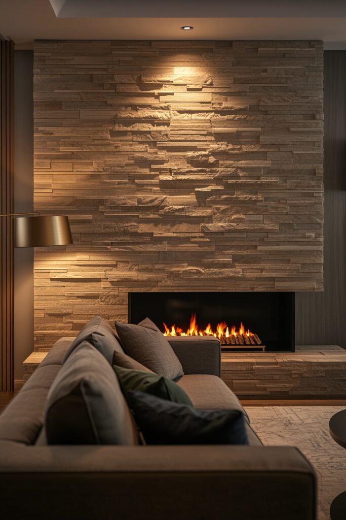
9. Fluted Plaster or MDF Panel Wall
Fluted panels — vertical ribbed surfaces in plaster, MDF, or timber — add a refined, architectural texture that suits modern, transitional, and Art Deco interiors. The ribs are typically 15–25 mm wide with shallow V-grooves between them, creating gentle shadows that shift with the light throughout the day. Mount pre-made fluted MDF panels on the accent wall and paint in the same colour as the wall for a tone-on-tone effect, or in a contrasting shade for more definition.
This treatment reads particularly well behind the bed, behind a floating vanity in a bathroom, or on the wall beside a dining table. Paint in a matte or eggshell sheen so the shadows read softly. Pair with flat surrounding walls so the fluting is the room’s only textural statement.
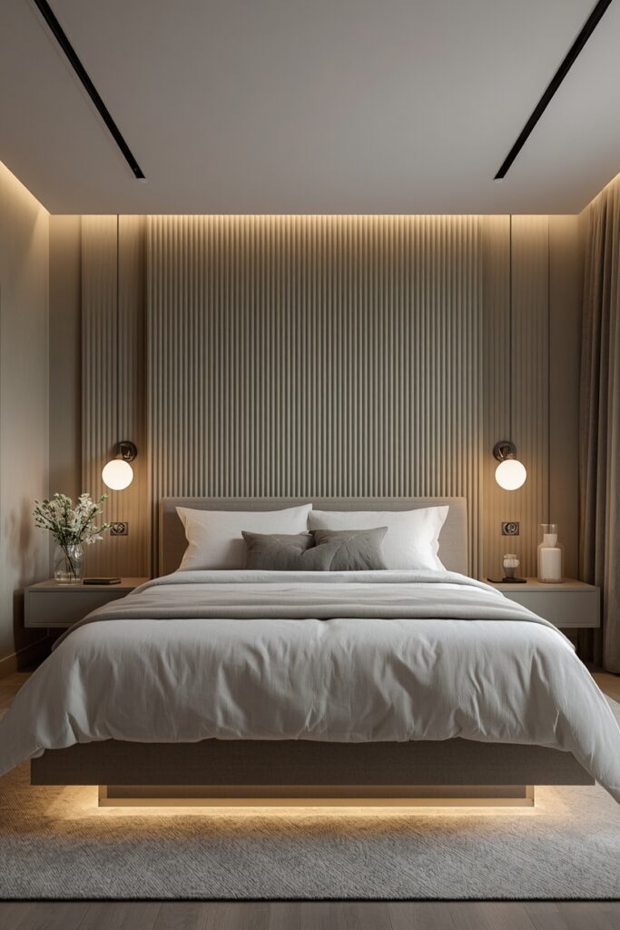
One tip: LED strip lighting recessed at the top or bottom of the fluted wall washes the ribs with light, dramatically amplifying the shadow-and-highlight effect in the evening.
10. Tile Feature Surface in a Living Space
Tile is not reserved for kitchens and bathrooms — a tile accent wall in a living room, dining room, or bedroom brings a material depth that paint and wallpaper cannot match. Use a handmade tile like zellige for a shimmering, organic texture, encaustic cement tile for a bold pattern, or a large-format porcelain in a marble or concrete look for a seamless, modern surface. Apply it to one wall — the fireplace surround, the wall behind the sofa, or the wall behind the dining table. The tile should relate to the room’s material palette: zellige with warm wood and brass, cement tile with a minimal white and black scheme, porcelain with modern flat-panel furniture.
Grout colour should match or closely complement the tile to keep the surface reading as one plane. This is a permanent treatment, so commit to it in rooms where you plan to stay — unlike paint or wallpaper, tile removal is destructive and costly.
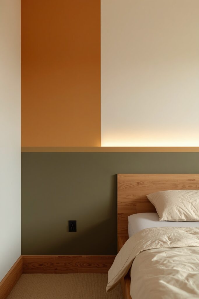
11. Accent Wall Ideas With a Two-Tone Paint Split
Splitting the accent wall horizontally — a darker colour on the lower portion and a lighter colour on the upper portion — creates a chair-rail effect without any moulding. The split line typically sits at 90–100 cm from the floor, dividing the wall into a grounded base and a lighter upper zone. Popular pairings include deep olive below with warm white above, mushroom below with cream above, and slate blue below with pale gray above. Use a laser level to mark the split line precisely — even a 1 cm wobble shows at a distance. Apply painter’s tape along the line and paint the darker colour first, then the lighter above. A slim wooden or MDF trim strip at the junction provides a clean transition and hides any paint bleed. This treatment suits bedrooms, living rooms, and dining rooms. It is one of the simplest and cheapest accent wall treatments, requiring only two cans of paint and a roll of tape.
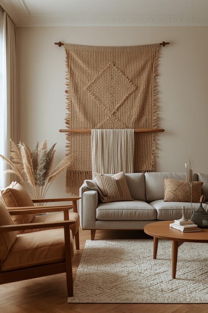
12. Woven Textile or Tapestry Wall Hanging
A large woven textile — a macramé piece, a hand-woven tapestry, or a mud-cloth panel — mounted on the accent wall brings tactile warmth and artisan character that hard surfaces cannot replicate. Choose a piece at least 90 cm wide so it reads as a wall treatment rather than a single decoration. Mount it on a dowel or a slim wooden rod and hang from two brackets at the desired height — typically centred on the wall behind the sofa or bed. The textile should share the room’s colour palette: earthy neutrals for bohemian and organic interiors, black and white for modern spaces, or soft pastels for Scandinavian rooms. The surrounding wall stays in a solid colour that complements the textile’s background.
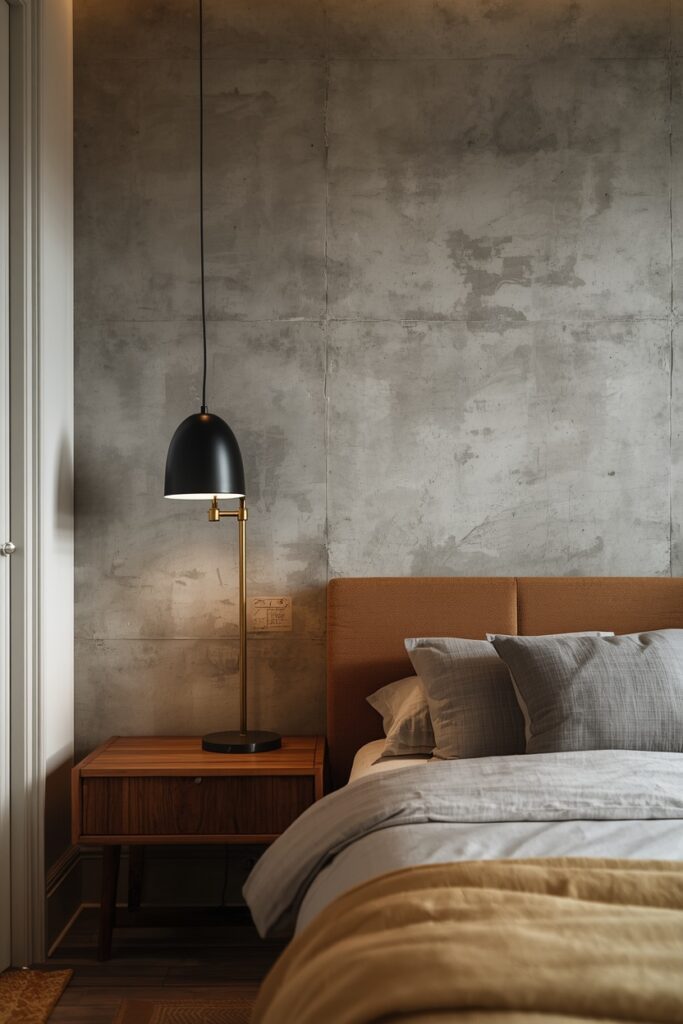
This approach is fully removable and renter-friendly — no paint, no holes beyond two small brackets. It also absorbs sound, which is a genuine practical benefit in rooms with hard floors and minimal soft furnishings.
13. Concrete or Plaster Effect Wall
A concrete or Venetian plaster effect — achieved with specialty paint, microcement, or lime plaster — gives a wall the raw, industrial texture of poured concrete or aged plaster without the weight or cost. Apply microcement or a textured plaster compound with a trowel in overlapping strokes, building up 2–3 mm of thickness. The result is a surface with subtle trowel marks, colour variation, and a tactile depth that flat paint cannot replicate. Choose a warm gray, soft putty, or sandy beige for the most versatile palette. Seal the surface with a clear matte topcoat to protect against marks and moisture.
This treatment suits living rooms, bedrooms, and dining rooms — particularly behind a sofa or bed where the texture catches side light. Pair with warm wood furniture and soft textiles to balance the rawness of the surface. One trade-off: the application is labour-intensive and benefits from practice — a small test patch on a hidden wall or a board is recommended before tackling the main surface.
14. Dark Ceiling as the Accent Surface
The ceiling is a wall — the fifth wall — and painting it in a dark or bold colour while leaving the four vertical walls light inverts the typical accent-wall formula. A dark ceiling draws the eye upward, creates an intimate canopy effect, and makes a room read dramatically different from the standard white-ceiling default. Choose a deep tone: charcoal, midnight blue, or dark forest green. The vertical walls stay in warm white or the palest version of the ceiling colour to maintain brightness and contrast.
This treatment suits bedrooms (creates a cocoon for sleeping), dining rooms (creates intimacy for evening meals), and powder rooms (adds drama in a small space). Use a flat or matte sheen on the ceiling to avoid reflective sheen that highlights imperfections in the plaster above.
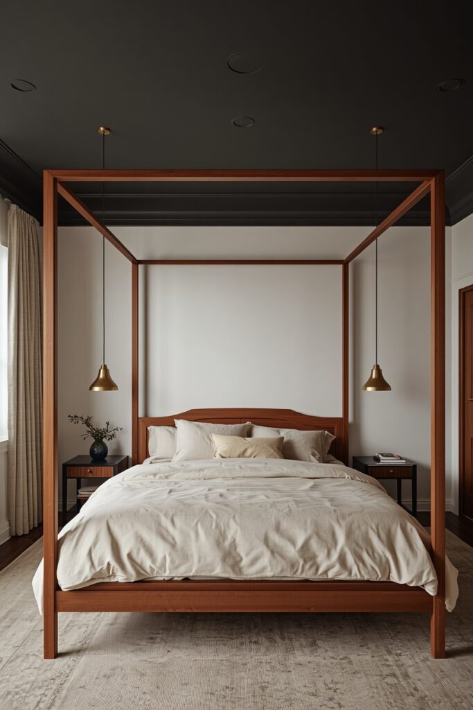
Apply with a roller on an extension pole and cut in at the wall-ceiling junction with a brush and tape. The result is unexpected and striking — a room that surprises without shouting.
15. Mirror Panel Feature Surface
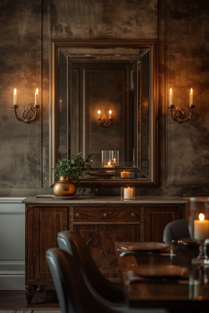
A wall of mirror panels — either large frameless sheets bonded to the wall or a grid of antiqued mirror tiles — doubles the visual depth of a room and multiplies the available light. Use this treatment on the wall opposite or perpendicular to the main window to bounce natural light deep into the space. In a dining room, a mirrored wall behind a sideboard reflects candlelight during evening meals. In a living room, it amplifies a small space into something that reads twice its size. Choose between clear mirror for maximum reflection or antiqued mirror (with a smoky, patinated surface) for a softer, vintage effect. The installation should be seamless: large frameless panels bonded with mirror adhesive, or tiles with minimal spacing and a matching grout or butt-jointed. One practical note: a mirror wall reflects everything — including clutter on the opposite wall. Edit the view before installing so the reflection shows a composed, attractive scene.
16. Gallery Accent Wall Ideas With Salon-Style Art
A salon-style gallery wall — frames of mixed sizes and orientations arranged edge to edge across an entire wall — turns the wall itself into the accent through density and curation rather than paint or material. Use one frame colour family (all black, all natural wood, or all thin brass) for cohesion. Mix content: photographs, prints, small mirrors, textile swatches in frames, and one or two three-dimensional objects (a mounted plant, a small shelf with a ceramic). Space frames 5–7 cm apart and plan the layout on the floor before hanging — snap a photo of the arrangement and use it as your guide. The surrounding walls stay clean and bare so the gallery wall carries the room’s personality entirely.
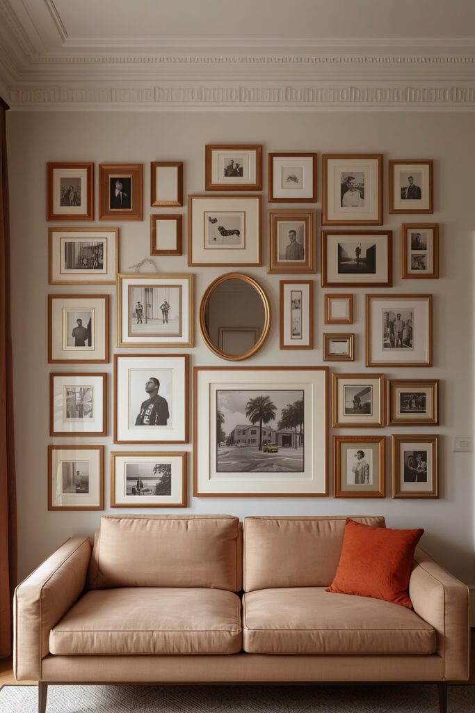
This treatment suits living rooms, hallways, stairwells, and bedrooms. A picture light or a track light washing the wall from above gives the arrangement gallery presence and warm evening visibility.
Where I’d Start if I Only Did Three Things
If I only did three things, I would start by choosing the right wall — the one your eye finds first when you enter the room, usually opposite the doorway or behind the primary furniture piece. Second, I would commit to one treatment only (paint, wood, wallpaper — not a combination) so the accent wall reads as a single clear statement. Third, I would coordinate the surrounding walls: they should recede in a warm white or the palest version of the accent colour so the feature wall leads the room without competition.
Frequently Asked Questions
What accent wall ideas work best for small rooms?
A single bold paint colour on the wall you face when entering creates depth without closing the room in. Limewash and light-coloured wallpaper also add interest without absorbing too much light. Avoid very dark treatments on more than one wall in a small room, and pair the accent wall with light colours on the remaining three surfaces to maintain brightness.
Which wall should be the accent wall?
The wall your eye naturally finds first when you enter — usually the wall opposite the doorway. In a bedroom, the wall behind the headboard. In a living room, the wall behind the sofa or the fireplace wall. Avoid choosing a wall with multiple doors, windows, or interruptions — the accent treatment reads best on a clean, unbroken surface.
Can I have an accent wall in an open-plan room?
Yes — an accent wall in an open-plan space defines a zone (dining, living, or kitchen) without physical partitions. Choose the wall that anchors the zone’s primary furniture and keep the treatment contained to that single surface. The accent wall acts as a visual room divider, signalling where one zone ends and another begins.
How do I choose between paint and wallpaper for an accent wall?
Paint is lower cost, easier to change, and offers unlimited colour choice. Wallpaper adds pattern, texture, and visual complexity that paint cannot achieve. For a bold colour statement, paint is the simpler route. For pattern interest (botanicals, geometrics, textures), wallpaper delivers more impact. Peel-and-stick wallpaper splits the difference — temporary commitment with pattern payoff.
Final Thoughts
The strongest accent wall ideas share two qualities: they choose the right wall (the first surface your eye finds) and they commit to one treatment fully rather than hedging with half-measures. Pick a single approach from this list — bold paint, textured wood, handmade tile, or layered wallpaper — apply it to one wall, and coordinate the remaining surfaces to recede quietly. An accent wall designed with conviction transforms a room in a day.