
Most bedroom color ideas online show you a pretty room and name the shade as an afterthought — no undertone guidance, no trim pairing, no mention of how the colour behaves at night versus morning. This guide does the opposite. Each of the 15 schemes below leads with the wall colour, explains its undertone, pairs it with a trim and ceiling recommendation, and includes real paint picks you can order a sample of today.
A few ground rules before you start: always test at least a 30 × 30 cm painted swatch on the actual wall (not just hold up a chip), view it at both midday and under your evening lighting, and check how it reads against your existing flooring. Colour shifts dramatically under different bulb temperatures — a shade that looks warm and welcoming under a 2700K lamp can turn muddy under a 4000K overhead. Every scheme here assumes 2700K bedside lighting and whatever natural light your room provides.
1. Soft Warm White With Creamy Undertones
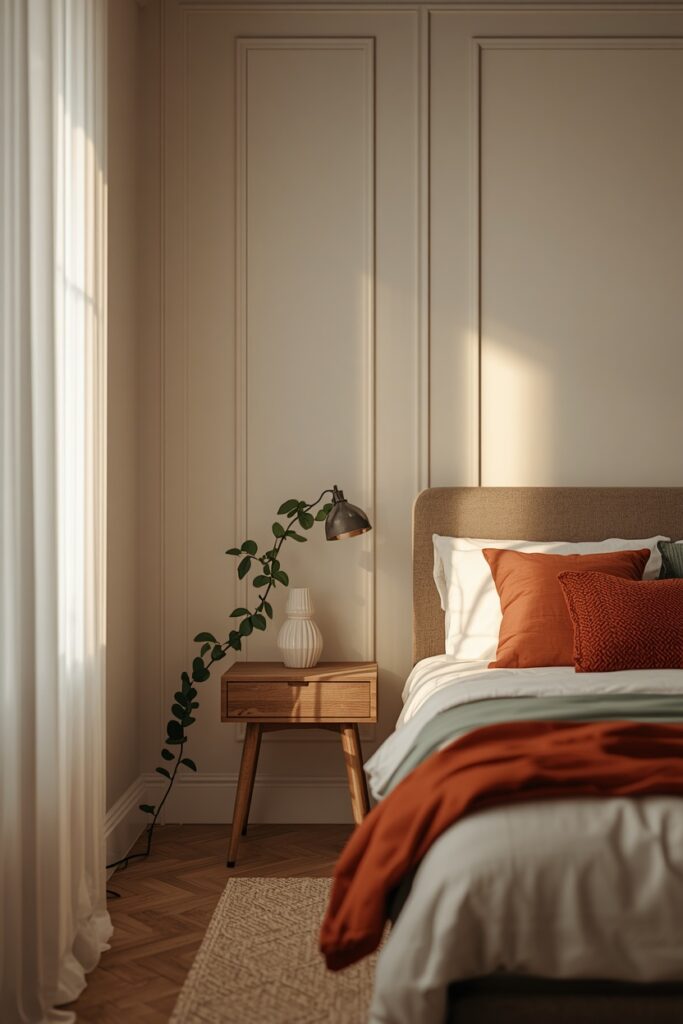
A true warm white — not stark, not yellow, but somewhere in between — is the most forgiving bedroom wall colour because it supports every furniture style and every textile palette. The trick is choosing a white with a cream or wheat undertone rather than a pink or blue one. Apply it to all four walls and the ceiling in the same shade, then use a semi-gloss version on the trim for a subtle contrast. This colour opens small rooms, plays well with both cool and warm metallics, and never fights your bedding choices.
Pair it with bedding in any accent colour — terracotta, sage, navy, blush — and the white recedes politely.
— Look for undertones listed as ‘cream,’ ‘wheat,’ or ‘golden’ — avoid ‘blush’ or ‘lilac’ undertones
— Use the same shade on ceiling and walls to erase the visual boundary
— Semi-gloss on trim gives enough contrast without a sharp line
— Test at night under lamplight — warm whites with too much yellow can read dingy under 2700K
Paint Picks: Benjamin Moore White Dove OC-17 • Sherwin-Williams Alabaster SW 7008 • Behr Blank Canvas DC-003
2. Sage Green With Warm Gray Trim
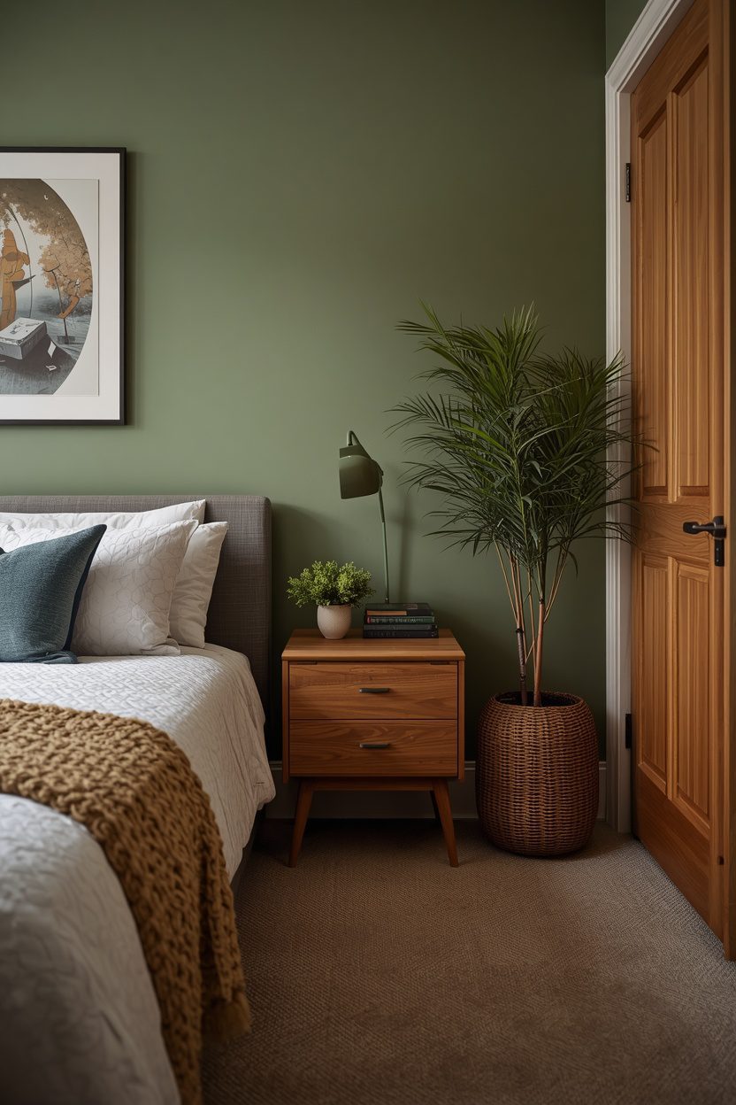
Sage green reads both organic and modern, and it shifts gently between warm and cool depending on the time of day — which is exactly what makes it interesting in a bedroom. Choose a mid-tone sage for the walls and pair it with warm gray trim rather than white, which can look too sharp against the green.
The ceiling should be a paler version of the sage or a neutral warm white. This palette pairs beautifully with natural wood in oak, ash, or maple, and with textiles in cream, sand, and soft rust.
— Warm gray trim softens the green transition better than bright white
— Choose sage shades with a gray undertone rather than a yellow one for a modern read
— Natural wood tones (oak, ash) complement sage; avoid cherry or mahogany
— Brass hardware anchors the warmth; chrome or nickel can cool the palette too much
Paint Picks: Benjamin Moore Sage Wisdom 2138-40 • Sherwin-Williams Evergreen Fog SW 9130 • Behr Laurel Garland S390-4
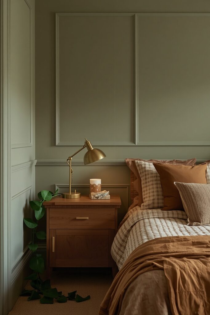
Avoid pairing sage with cool-toned silver hardware; brass or matte gold reads far better alongside green undertones.
3. Deep Navy Blue for a Cocooning Effect
Navy is the safe dark — it has the drama of black without the absorption problems and the richness of jewel tones without the boldness that scares resale-minded homeowners. Apply it on all four walls in an eggshell sheen for a subtle depth. The ceiling should go in a warm off-white or even a very pale blue-gray to create height relief. Trim in crisp white gives the room graphic structure.
— Eggshell sheen adds subtle depth; avoid flat, which can look chalky on dark colours
— Use a tinted primer in a dark gray or blue-gray to reduce the number of topcoats needed
— Pair with brass for warmth — avoid cool chrome which can turn the room cold
— Ceiling in warm white maintains visual height and prevents the room from closing in
Paint Picks: Benjamin Moore Hale Navy HC-154 • Sherwin-Williams Naval SW 6244 • Behr Compass Blue HDC-CL-28
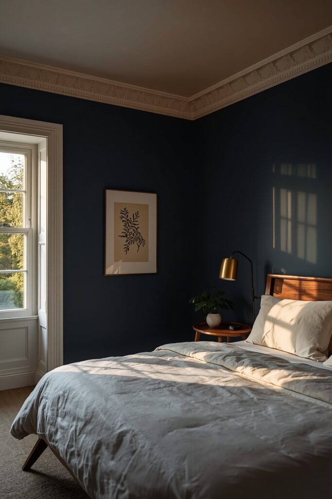
Navy pairs exceptionally well with brass lighting and hardware, white or ivory bedding, and warm wood furniture in walnut or teak tones. One trade-off: navy requires at least two coats and usually a tinted primer, so factor the extra labour into your paint budget.
4. Bedroom Color Ideas in Dusty Rose and Plaster Pink
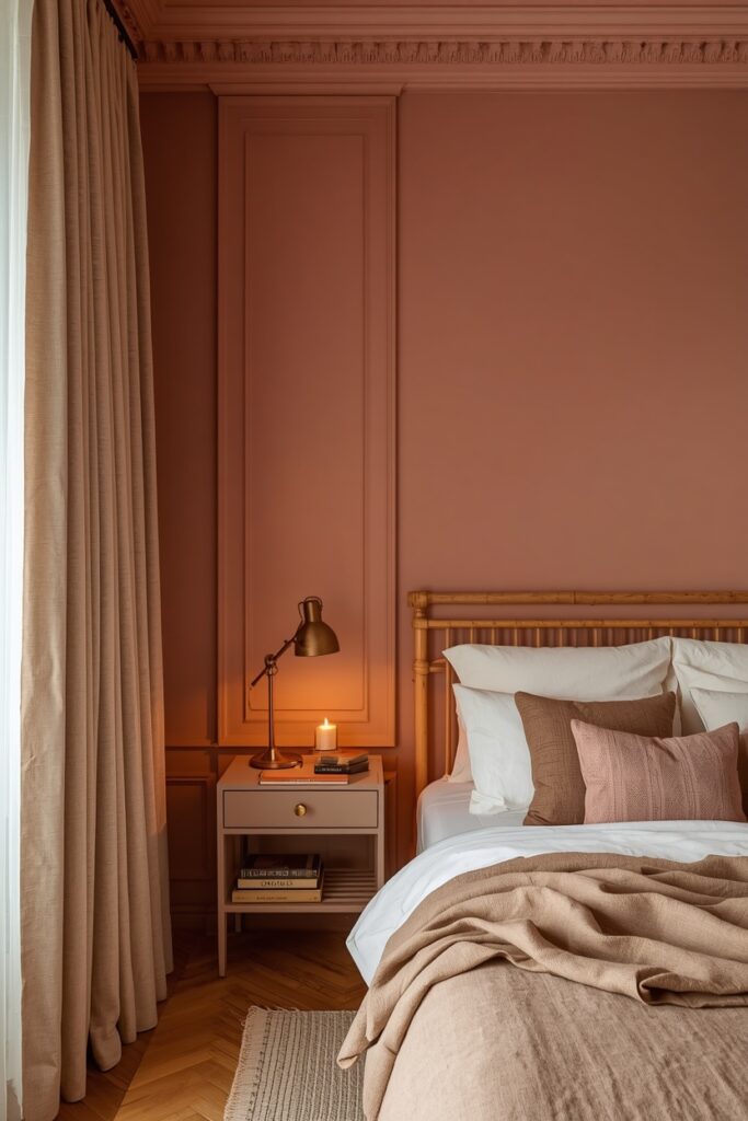
Dusty rose avoids the nursery association when it sits in the plaster-pink family — muted, slightly brown, and more sophisticated than saturated pinks. Apply it on all four walls and let the muted tone do the work; this colour does not need an accent wall treatment because it is already quiet enough to surround you. Trim should be a warm white or a very pale mushroom to keep the transitions soft. This palette loves matte brass, natural linen, and light-coloured woods like birch or bleached oak. Avoid pairing it with cool grays or black, which make the pink look weak rather than deliberate. Bedding in cream, stone, and a slightly deeper rose creates a tonal layered effect that reads rich without shouting.
— Choose pink shades with brown or terracotta undertones, not blue or lilac
— Warm white or mushroom trim keeps transitions soft; avoid bright white which creates harsh contrast
— Matte brass and natural linen are ideal companions for this palette
— Avoid cool gray or black accents which can make the pink look washed out
Paint Picks: Benjamin Moore Venetian Portico AF-185 • Sherwin-Williams Likeable Sand SW 6058 • Behr Retro Pink S160-2
5. Charcoal Gray With a Warm Undertone
Charcoal is not one colour — it ranges from blue-charcoal to green-charcoal to brown-charcoal, and the undertone matters enormously in a bedroom. For warmth, choose a charcoal with a brown or taupe undertone; it will read dark and enveloping without the coldness that blue-grays can bring under artificial light. Apply it in an eggshell or satin sheen to catch light and prevent the flat, chalky look that matte dark paints sometimes produce. Trim in warm white provides clean definition. This scheme pairs with metallic accents in gold, brass, or copper, and with bedding in ivory, camel, and soft rust.
— Brown or taupe undertones keep charcoal warm under 2700K evening light
— Eggshell or satin sheen catches light and prevents chalky appearance on dark walls
— Sand and skim-coat walls thoroughly — dark colours highlight every imperfection
— Keep ceiling lighter to maintain visual height; pale warm gray is a safe choice
Paint Picks: Benjamin Moore Kendall Charcoal HC-166 • Sherwin-Williams Urbane Bronze SW 7048 • Behr Black Garnet PPU18-20
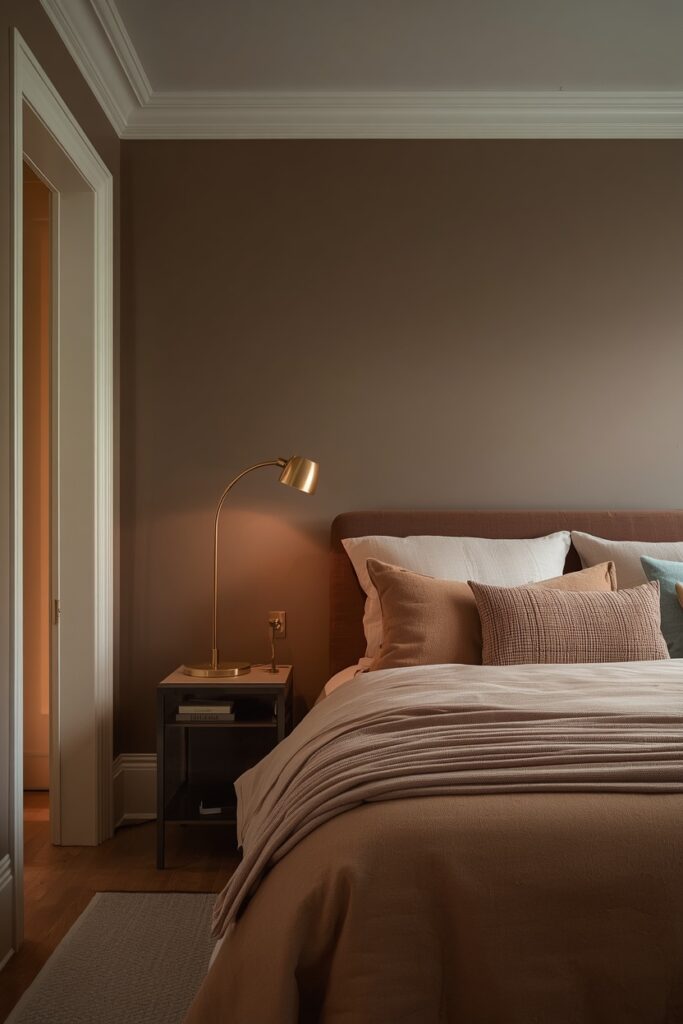
Keep the ceiling lighter — a pale warm gray or off-white — so the room retains height. One practitioner note: dark walls highlight imperfections in plaster and drywall, so skim-coat and sand carefully before painting.
6. Terracotta Orange for Earthen Warmth
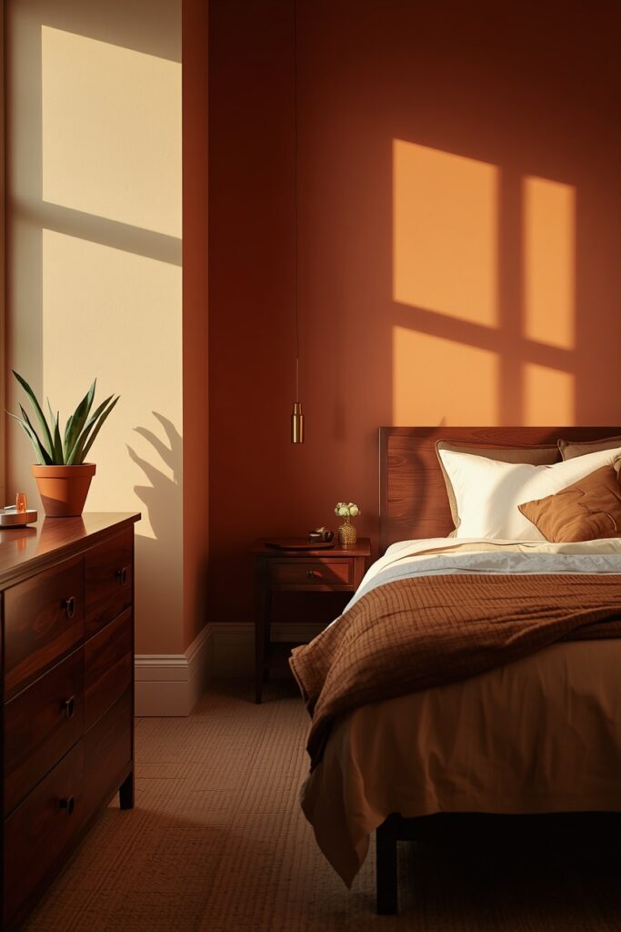
Terracotta is not the bright orange of a sports jersey — it is a clay-baked, sun-dried hue with brown in its base that makes it one of the warmest wall colours available. Use it on a single accent wall behind the bed or go bold on all four walls if the room has enough white or cream in the furniture and bedding to balance it. Trim in a warm off-white softens the edges. This colour sings with dark wood furniture — walnut, espresso-stained oak — and with textiles in cream, burnt umber, and deep olive.
Under 2700K lamplight, terracotta walls glow. Under cool 4000K or daylight-balanced bulbs, they can turn muddy and orange, so verify your lighting before committing.
— Terracotta with brown undertones reads earthy; avoid shades that lean orange-red
— Test under 2700K light — this colour shifts dramatically under cool-white bulbs
— Balance with cream or white textiles if painting all four walls
— Dark wood furniture (walnut, espresso oak) grounds the warmth; avoid light maple which can clash
Paint Picks: Benjamin Moore Potters Clay 1221 • Sherwin-Williams Cavern Clay SW 7701 • Behr Canyon Dusk S210-4
7. Moody Forest Green for Maximum Drama
Forest green on every wall — ceiling included if you are committed — turns a bedroom into a space that wraps around you like a canopy. Choose a deep green with a blue undertone for sophistication or a yellow undertone for warmth; the blue-greens photograph moodier while the yellow-greens glow richer under lamplight. This colour demands metallic contrast: brass sconces, a gold-framed mirror, or copper pendant light.
Trim can be the same green in a higher sheen (satin versus matte on the walls) for a tone-on-tone look, or a warm cream for more definition. Bedding should provide relief — ivory, champagne, or soft blush — so the room has a visual anchor point.
— Blue-undertone greens read moodier; yellow-undertone greens glow warmer under lamplight
— Tone-on-tone trim (same green in satin sheen) gives a sophisticated wrapped effect
— Brass, gold, or copper metallics are essential to break up the depth
— This colour hides wall scuffs better than most — a practical advantage for busy households
Paint Picks: Benjamin Moore Essex Green HC-188 • Sherwin-Williams Rookwood Dark Green SW 2816 • Behr Billiard Green S-H-460
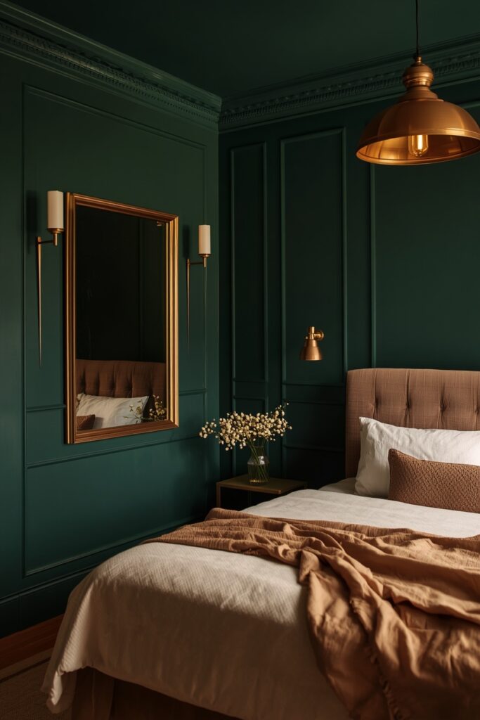
Dark green hides scuffs well, which is a genuine practical advantage.
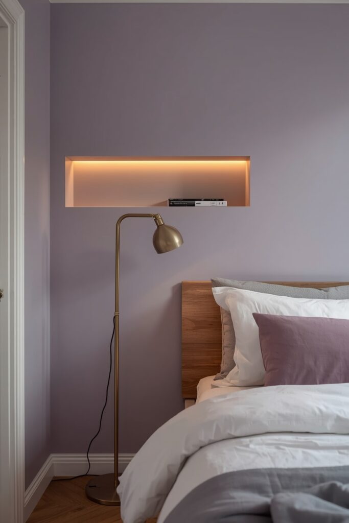
8. Lavender Gray for Quiet Sophistication
Lavender gray sits at the intersection of purple and neutral — it carries just enough colour to register without overwhelming, and it shifts between cool and warm depending on the light. In a north-facing room with cool daylight, it reads slightly purple; in a south-facing room or under warm lamplight, it softens to an almost silver-mauve. Pair it with cool-toned metals like brushed nickel or chrome, and with bedding in white, pale gray, and the softest lilac. The trim should be a clean white to give the subtle colour definition, and the ceiling stays white or the very palest version of the wall shade. Wood tones should lean toward ash or bleached oak rather than warm walnut, which can fight the cool purple undertone. This is a sophisticated choice that reads gender-neutral and ages well.
— Lavender grays read more purple in cool north-facing light — test on the actual wall
— Brushed nickel or chrome metals complement the cool undertone better than warm brass
— Bleached oak or ash wood tones harmonise; warm walnut can clash
— This colour reads gender-neutral and polished — a strong resale choice
Paint Picks: Benjamin Moore Silver Mist 1619 • Sherwin-Williams Swanky Gray SW 6261 • Behr Dusty Lilac N100-2
9. Warm Mushroom for an Organic Neutral
Mushroom sits between beige and gray — it borrows warmth from brown tones without the dated quality of tan, and depth from gray without the coldness. This makes it one of the most versatile bedroom neutrals available. Apply it to all four walls and the ceiling for an immersive cocoon, or pair it with bright white trim for a cleaner, more structured look. Mushroom loves natural materials: raw linen, jute rugs, wooden furniture in almost any tone, and matte ceramic accessories. It is equally at home with modern furniture or vintage pieces.
— Mushroom with equal gray and brown undertones is the most versatile — avoid shades that lean too yellow
— Ceiling in the same shade creates an immersive wrapped effect; bright white trim creates more structure
— Natural materials (raw linen, jute, wood, ceramic) are ideal companions
— Avoid pairing with cool blues or stark black — the contrast can make mushroom read dingy
Paint Picks: Benjamin Moore Ashley Gray HC-87 • Sherwin-Williams Mega Greige SW 7031 • Behr Studio Taupe PPU5-07
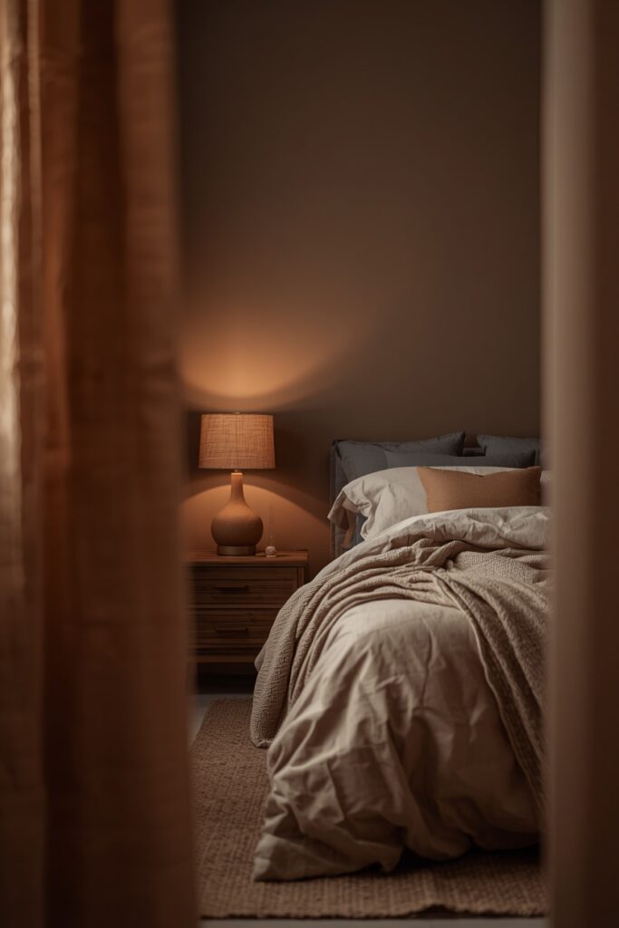
Under 2700K lamplight, mushroom walls glow with a toasty warmth that reads incredibly restful after dark. Avoid pairing it with cool blues or stark blacks, which can make the mushroom look dingy by comparison.
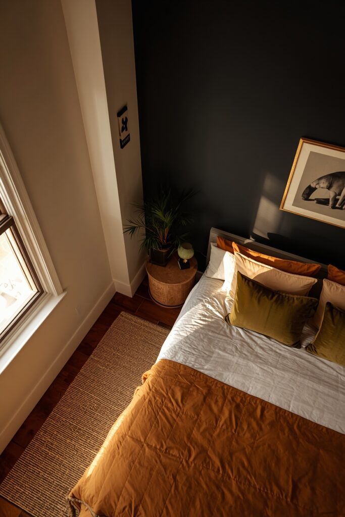
10. Bedroom Color Ideas With a Black Accent Wall
A single black wall behind the bed — with the remaining three in warm white or pale mushroom — delivers high contrast without the commitment of a fully dark room. The key to making it work is the undertone of your black: choose a black with a brown or green undertone for warmth, and avoid blue-blacks which can read cold in a bedroom setting. Paint it in a matte sheen so it absorbs light evenly. The adjacent walls should be warm enough to glow against the dark surface. Bedding in warm whites, cream, and one bold accent colour (mustard, rust, or olive) pops against the black backdrop.
Hang art in light-coloured mats and thin gold frames to create focal points on the dark wall. This scheme demands confident proportions — keep furniture simple and avoid cluttering the black wall with too many objects.
— Brown or green-undertone blacks read warmer than blue-blacks in bedroom settings
— Matte sheen absorbs light evenly on the dark wall; satin can create unwanted reflective spots
— Warm white on the adjacent three walls creates a natural glow contrast
— One bold accent colour (mustard, rust, olive) in the bedding prevents the room from reading monotone
Paint Picks: Benjamin Moore Black Panther 2125-10 • Sherwin-Williams Tricorn Black SW 6258 • Behr Broadway PPU18-20
11. Pale Blue-Gray for a Calming Retreat
Pale blue-gray is the quietest colour on this list — it barely registers as a colour at all until you hold a white sheet against it, and that subtlety is its strength. It reads calm and airy without the clinical sterility of white, and it adapts to almost any furniture style. Choose a shade with a green or gray undertone rather than a purple one; the green-gray versions maintain warmth better under the 2700K bulbs most bedroom lamps produce.
Paint all four walls and keep the ceiling in the same shade or the palest white. Trim in white gives a clean, coastal-adjacent look.
— Green or gray undertones maintain warmth under 2700K; avoid purple undertones that can read icy
— Same shade on walls and ceiling creates a seamless airy effect
— Supports both warm and cool metallics — forgiving if your existing fixtures don’t match
— Barely-there colour reads calm without the clinical quality of pure white
Paint Picks: Benjamin Moore Quiet Moments 1563 • Sherwin-Williams Tradewind SW 6218 • Behr Watery HDC-CT-26
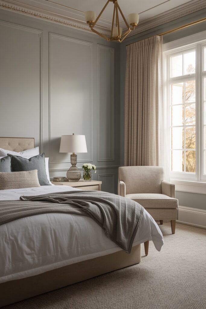
This colour supports both warm and cool metallics, which gives you freedom to mix brass and nickel if your existing fixtures don’t match.
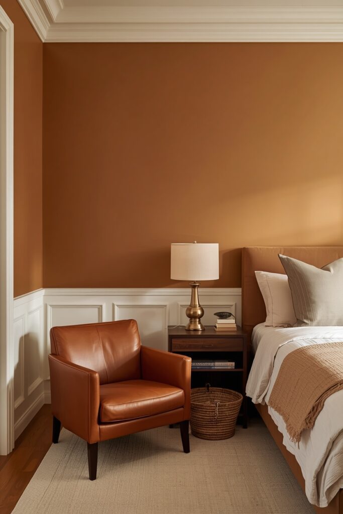
12. Caramel and Honey for a Sun-Drenched Look
Caramel walls create the illusion of perpetual golden hour — a sun-soaked warmth that makes the room glow even on cloudy days. Choose a caramel with a yellow-brown base rather than an orange one, and apply it in a satin sheen to catch light gently. Trim should be a creamy white — not stark — so the transition from wall to frame stays soft. This palette loves cognac leather, aged brass, natural rattan, and linen in cream and warm white. Dark wood nightstands in espresso or walnut ground the sweetness and prevent the room from reading too saccharine. Bedding in warm neutrals — cream, stone, soft rust — lets the walls stay the star. Under evening light, caramel walls radiate warmth in a way that neutrals cannot replicate.
— Yellow-brown base caramels glow; orange-based caramels can read too saturated
— Satin sheen catches light gently without the flatness of matte
— Creamy white trim softens the transition; stark white creates too much contrast
— Dark wood furniture grounds the sweetness — essential to prevent the room from tipping too warm
Paint Picks: Benjamin Moore Caramel Corn 2160-20 • Sherwin-Williams Torchlight SW 6374 • Behr Amber Wave S290-5
13. Slate Blue for Moody Calm
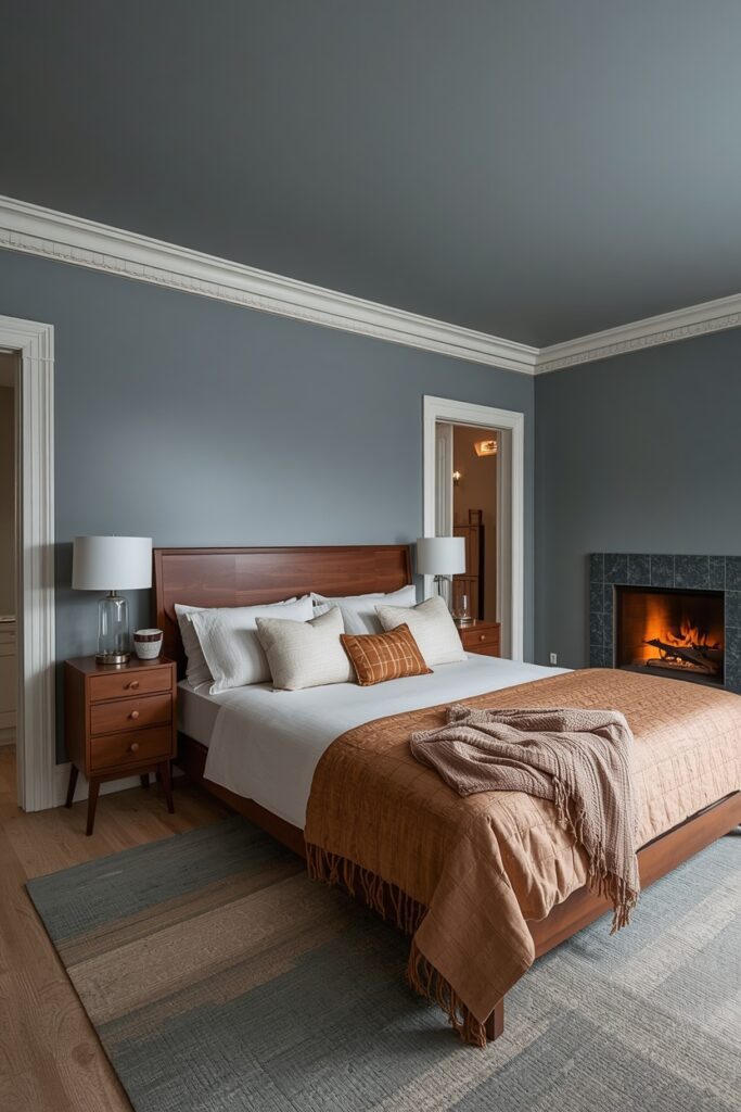
Slate blue occupies the space between navy and gray — it is dark enough to create atmosphere but not so saturated that it closes a room in. Choose a shade with a gray undertone for a modern read, or a green undertone for a softer, more organic look. Apply it to all four walls in an eggshell sheen, with ceiling in the palest version of the same hue. White trim gives clean structure; a warm gray trim softens the look. Furniture in warm wood tones — walnut, oak, or teak — balances the cool wall colour.
Bedding in white, ivory, and warm amber creates a striking contrast. This colour hides marks reasonably well and ages gracefully, making it a solid choice for primary bedrooms you do not plan to repaint for five or more years.
— Gray-undertone slate blue reads modern; green-undertone reads softer and more organic
— Pale version of the same hue on the ceiling maintains colour continuity
— Warm wood furniture (walnut, oak, teak) balances the cool wall colour
— This shade ages gracefully and hides marks well — a strong long-term choice
Paint Picks: Benjamin Moore Normandy 2129-40 • Sherwin-Williams Smoky Blue SW 7604 • Behr Granite Falls N480-5
14. Rich Plum for a Luxurious Statement
Plum is the colour for people who want drama but find jewel greens and navies too predictable. A deep plum with a red undertone reads warm and inviting; one with a blue undertone leans cooler and more regal. Either direction works in a bedroom — the red version suits rooms with warm wood floors, while the blue version pairs better with cool-toned carpets or concrete. Apply it on one accent wall or all four, depending on room size and natural light. Metallic companions should be gold or antique brass, which warm the purple; chrome reads too clinical against plum.
— Red-undertone plums read warm; blue-undertone plums read cooler and more regal
— Gold or antique brass metallics warm the purple; avoid chrome which reads clinical
— Expect three coats for even coverage — budget extra paint and labour
— Champagne and ivory bedding creates the best tonal contrast against deep plum walls
Paint Picks: Benjamin Moore Dark Purple 2073-10 • Sherwin-Williams Mature Grape SW 6286 • Behr Euphoric Magenta M110-7
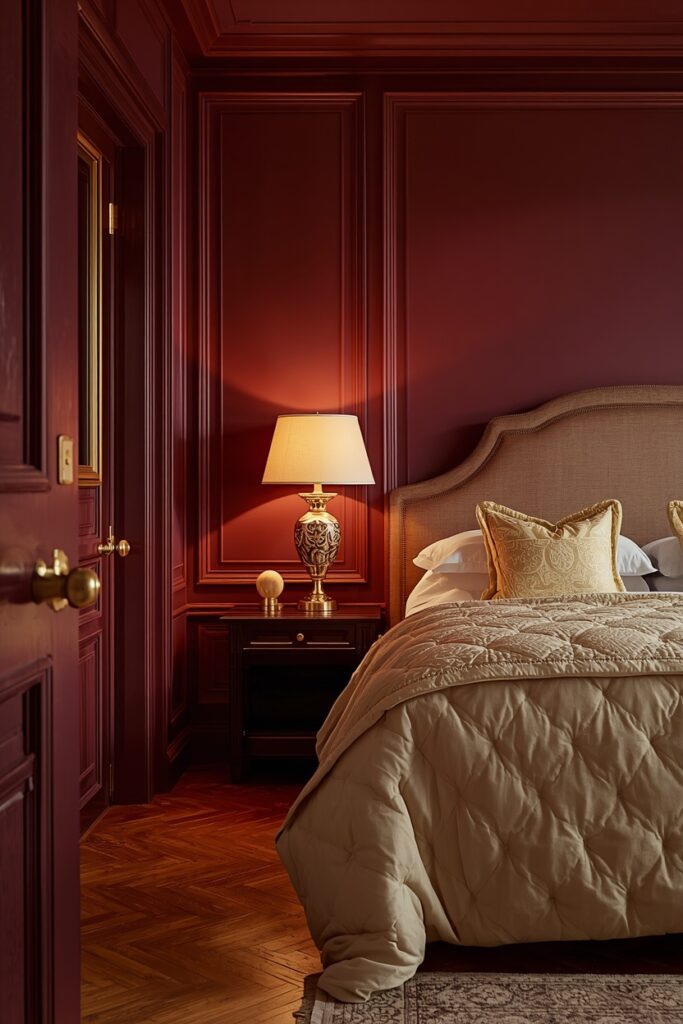
Bedding in champagne, ivory, and soft gold creates a rich tonal contrast. Fair warning: plum requires three coats for even coverage, especially over light-coloured walls, so budget extra time and paint.
15. Two-Tone Bedroom Color Ideas With a Chair-Rail Split
Splitting the wall at chair-rail height — roughly 90 to 100 cm from the floor — lets you use two coordinating colours without the commitment of a single bold shade floor to ceiling. The lower portion should be the darker or bolder colour, and the upper portion a lighter complementary shade or a warm white. Install a slim wooden moulding strip at the split line for a clean transition.
Popular combinations include deep olive below with warm white above, mushroom below with cream above, and slate blue below with pale gray above. This treatment adds architectural interest to rooms with plain flat walls and gives the illusion of wainscoting at a fraction of the cost.
— Darker or bolder colour on the lower portion grounds the room visually
— Chair-rail height between 90–100 cm gives classic proportions; adjust for non-standard ceiling heights
— Use a laser level for the split line — even small wobbles show at a distance
— A slim wooden moulding strip creates a clean transition and hides any paint bleed
Paint Picks: Lower: Benjamin Moore Backwoods 469 / Upper: Benjamin Moore White Dove OC-17 • Lower: Sherwin-Williams Urbane Bronze SW 7048 / Upper: Sherwin-Williams Alabaster SW 7008 • Lower: Behr Dark Ash N520-7 / Upper: Behr Blank Canvas DC-003
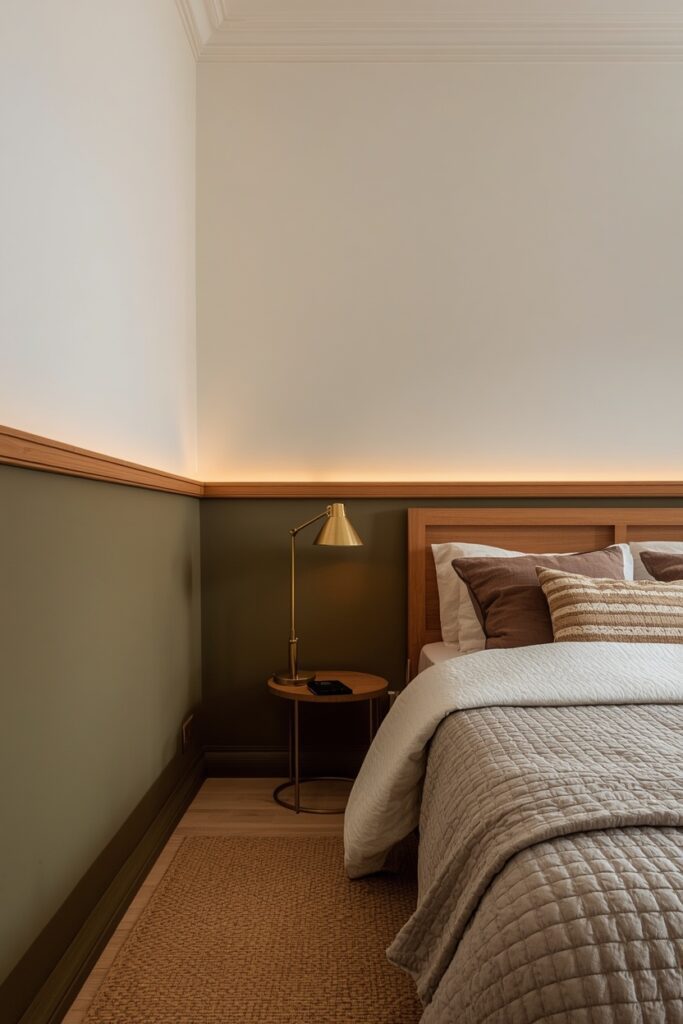
One practical note: measure and tape the split line carefully — even a 2 cm wobble shows when you step back, so use a laser level rather than a tape measure alone.
Where I’d Start if I Only Did Three Things
If I only did three things, I would start by buying three large sample pots and painting 30 × 30 cm swatches on the actual bedroom wall — one warm neutral, one mid-tone colour, and one dark — then living with them for 48 hours under day and night light before deciding. Second, I would pick the trim colour at the same time as the wall colour, because the trim-to-wall relationship defines the room’s crispness or softness more than the wall shade alone. Third, I would invest in 2700K bulbs for every fixture in the room before judging any colour, because the wrong bulb temperature can ruin even the perfect paint choice.
Frequently Asked Questions
What bedroom color ideas suit a north-facing room with limited light?
Warm-undertone colours counteract the cool, blue-ish light that north-facing rooms receive. Warm whites, soft caramels, and mushroom tones glow under these conditions. Avoid cool grays and blue-greens, which amplify the coldness. If you want colour, try a warm terracotta or dusty rose — both maintain warmth under limited natural light.
Should I paint the bedroom ceiling the same colour as the walls?
Painting the ceiling the same shade as the walls creates a wrapped, immersive effect that makes the room read as one continuous space. This approach is especially effective with mid-tones and darks. For very dark colours, painting the ceiling one or two shades lighter in the same family avoids a cave-like compression while maintaining the tonal unity.
How many coats do dark bedroom colours typically need?
Most dark colours — navy, charcoal, forest green, plum — require two to three coats over a tinted primer for even coverage. Using a primer tinted to a mid-tone gray or a shade close to the final colour reduces the number of topcoats needed and prevents light patches from showing through.
Can I mix warm and cool colours in the same bedroom palette?
You can, but the mix needs a bridging element. A warm terracotta pillow on a cool slate-blue bed only works if there is a neutral — cream, warm white, or natural wood — sitting between them. Without that bridge, the contrast reads like a clash rather than a deliberate pairing. Keep the dominant colour to about 70 percent and the secondary to 20 percent, with neutrals filling the remaining 10.
Final Thoughts
The right bedroom color ideas start with understanding your room — its light direction, its flooring tone, its bulb temperature — and then choosing a wall colour that responds to those conditions rather than fights them. Grab sample pots, test on the actual wall, and view your swatches at both 10 AM and 10 PM before committing. Every scheme on this list includes real paint picks you can order today, so the gap between inspiration and action is a single trip to the paint counter.