
A painted kitchen is the most accessible transformation in home design — one weekend, a few cans of quality paint, and a set of new handles can turn a dated kitchen into a room that reads completely redesigned. But the difference between a painted kitchen that looks professional and one that looks DIY is technique, preparation, and paint choice. These 14 painted kitchen ideas cover the full spectrum of colours and approaches, each with real paint-brand picks and honest guidance on preparation, application, and the durability you can expect.
Every idea below assumes you are painting existing kitchen cabinets rather than buying new pre-painted ones — though the colour and palette guidance applies equally if you are specifying new cabinetry. I have flagged where brush-and-roller application succeeds versus where a spray application is worth the extra effort or cost.
1. Classic Warm White Cabinet Colour
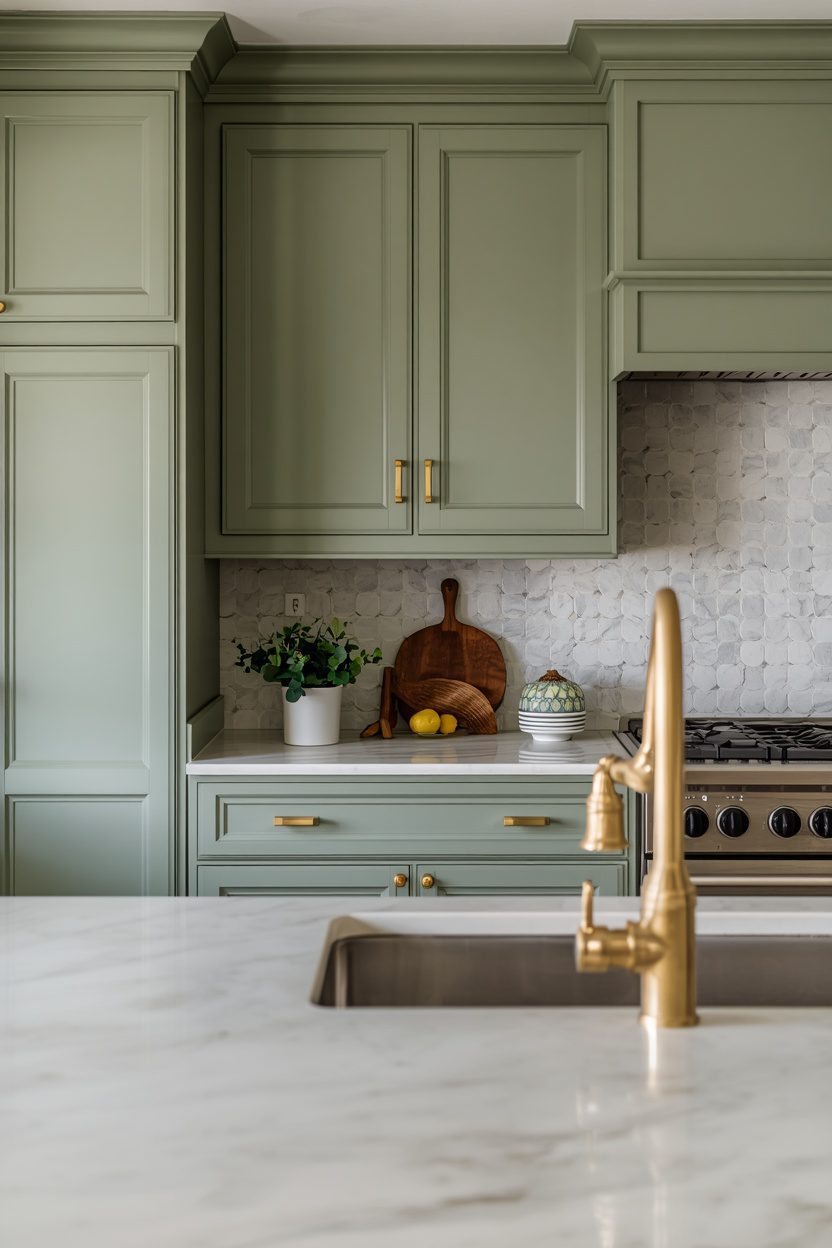
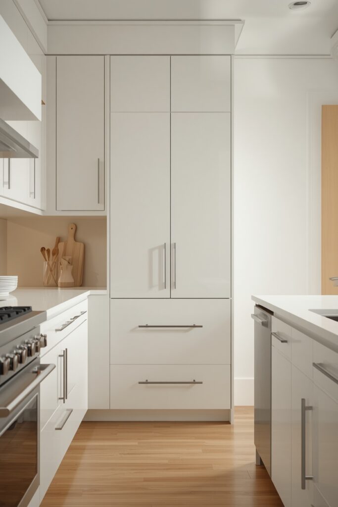
Warm white is the safest and most universally appealing painted kitchen colour — and it is the one that most people get wrong by choosing a stark, blue-toned white that reads cold and clinical under kitchen lighting. The key is choosing a white with a cream, wheat, or golden undertone that glows warm under 2700K bulbs. Apply with a foam roller on flat surfaces and a quality brush on edges and panel details. Two coats of a semi-gloss cabinet-grade paint over a bonding primer give the most durable, cleanable surface. Pair with brass or matte gold hardware for warmth, or matte black for contrast.
The countertop can be anything — marble, quartz, butcher block, concrete — because warm white supports every material. This is the resale-safe choice and the starting point for anyone unsure about committing to colour.
— Choose whites with cream, wheat, or golden undertones — avoid blue or pink undertones
— Semi-gloss sheen cleans easiest and shows minor imperfections less than high-gloss
— Always test the white against your actual countertop and backsplash under evening light
Paint Picks: Benjamin Moore White Dove OC-17 • Sherwin-Williams Alabaster SW 7008 • Behr Blank Canvas DC-003
2. Sage Green for Earthy Modern Kitchens
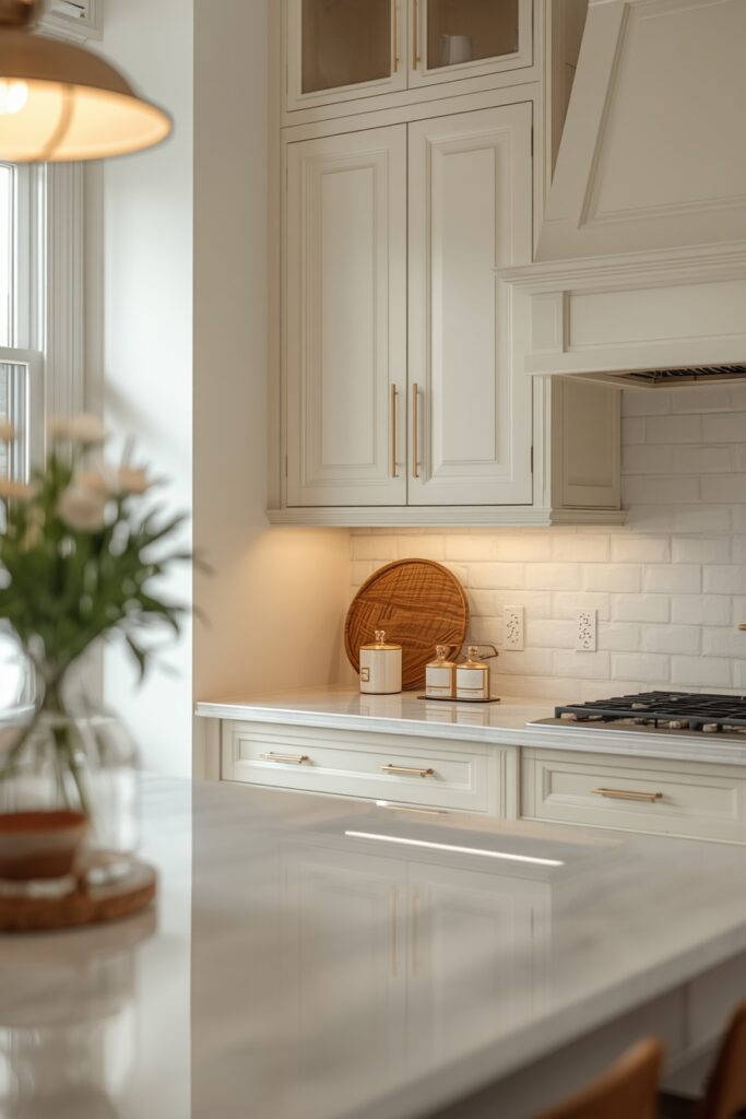
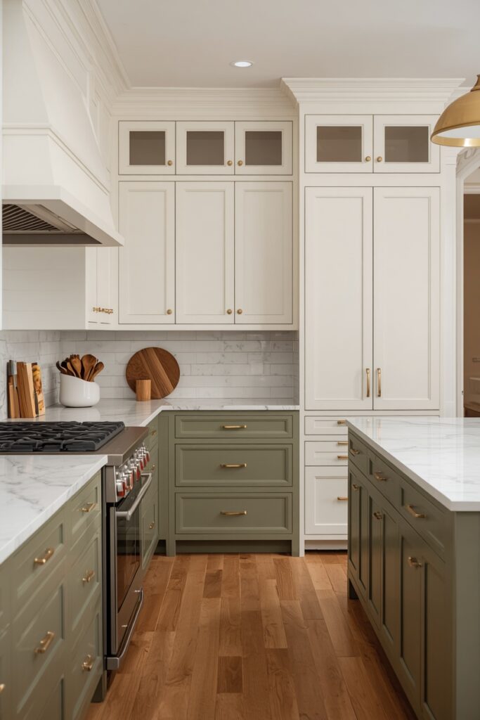
Sage green on kitchen cabinets reads organic and modern — warmer than mint, calmer than emerald, and more interesting than gray. Choose a sage with a gray undertone for a contemporary read or a yellow undertone for a warmer, more farmhouse-adjacent look. Apply to the lower cabinets and island, keeping uppers in warm white for a lighter feel, or go sage on everything for full commitment.
Brass or matte gold hardware complements the warm undertone; avoid chrome, which cools the palette. Sage shifts between warm and cool depending on the light — test a painted swatch on the actual cabinet under both daylight and 2700K evening light before committing.
— Gray-undertone sages read more modern; yellow-undertone sages read warmer and more traditional
— Brass or matte gold hardware picks up the sage’s warm undertone best
— Test under evening lighting — sage shifts dramatically between daylight and 2700K
Paint Picks: Benjamin Moore Sage Wisdom 2138-40 • Sherwin-Williams Evergreen Fog SW 9130 • Behr Laurel Garland S390-4
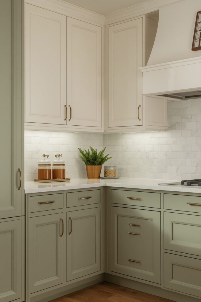
A honed marble or warm white quartz countertop and a zellige or subway backsplash in warm white complete the palette.
3. Deep Navy for Rich Depth
Navy painted cabinets bring gravitas without the maintenance challenges of matte black — navy hides fingerprints and cooking splatter better than white while absorbing less light than charcoal. Apply on the lower cabinets and island with warm white uppers for a classic two-tone, or on all cabinets for a bold, enveloping look. Choose a navy with a warm undertone so it glows under kitchen lighting rather than reading cold. Brushed brass hardware is the definitive pairing — the warm metallic against the deep blue creates a nautical-inspired contrast that never dates.
— Warm-undertone navies glow under 2700K; cool navies can read almost black at night
— Tinted primer in dark gray reduces the number of topcoats needed
— Navy shows dust as a chalky film — wipe with a damp microfibre cloth weekly
Paint Picks: Benjamin Moore Hale Navy HC-154 • Sherwin-Williams Naval SW 6244 • Behr Compass Blue HDC-CL-28
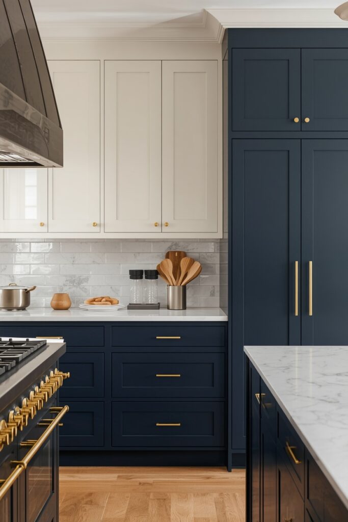
A light countertop (white marble, pale quartz, or butcher block) balances the dark cabinets. Navy requires a tinted primer and at least two topcoats for even coverage — budget extra paint compared to lighter colours.
4. Two-Tone Painted Kitchen Ideas With Contrasting Island
Painting the island in a different colour from the perimeter cabinets gives it a furniture-like presence and prevents the kitchen from reading monotone. The perimeter sets the dominant tone; the island provides the contrast. Successful pairings include white perimeter with sage island, pale gray perimeter with navy island, cream perimeter with charcoal island, and warm white perimeter with terracotta island. The countertop material should bridge the two zones: a marble or quartz whose veining contains tones from both cabinet colours. Keep the hardware consistent across both zones (same metal, same pull style) to unify the palette. The two-tone approach requires precise paint matching — the two colours should complement, not compete — so test swatches of both colours side by side on the actual cabinets under your kitchen lighting before committing.
— Use the same hardware metal across both zones to unify the two-tone palette
— Test both colours side by side on actual cabinet surfaces under your lighting
— Keep the kitchen to exactly two cabinet colours — a third introduces visual noise
Paint Picks: Perimeter: SW Alabaster 7008 / Island: SW Evergreen Fog 9130 • Perimeter: BM White Dove OC-17 / Island: BM Hale Navy HC-154 • Perimeter: Behr Blank Canvas DC-003 / Island: Behr Canyon Dusk S210-4
5. Charcoal Gray for a Sophisticated Neutral
Charcoal painted cabinets sit between black and light gray — dark enough to anchor a kitchen with sophistication, light enough to avoid the light-absorption problems of full black. Choose a charcoal with a brown or taupe undertone for warmth under 2700K kitchen lighting. Apply in a semi-gloss or satin sheen for easy cleaning — matte charcoal shows every smudge as a chalky mark. Hardware in brushed brass, matte gold, or polished nickel all pair well; charcoal is one of the most hardware-flexible colours.
— Brown or taupe undertones keep charcoal warm under kitchen lighting
— Satin or semi-gloss sheen cleans better than matte and hides minor imperfections
— Charcoal hides daily wear better than white or matte black — the practical sweet spot
Paint Picks: Benjamin Moore Kendall Charcoal HC-166 • Sherwin-Williams Urbane Bronze SW 7048 • Behr Black Garnet PPU18-20
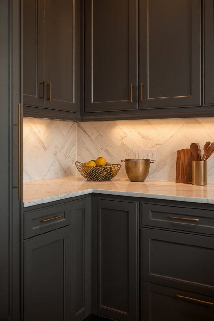
A warm-veined marble or warm white quartz countertop balances the darkness. Charcoal hides daily wear, grease, and fingerprints better than both white and matte black, making it the practical middle ground for busy kitchens that want dark cabinets without the maintenance headaches.
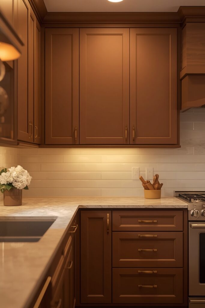
6. Terracotta for Mediterranean Warmth
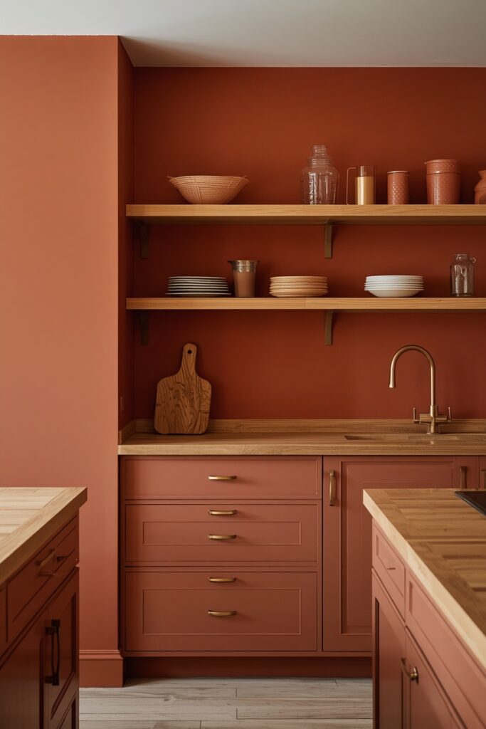
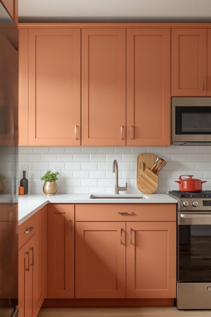
Terracotta painted cabinets bring a sun-baked clay warmth that suits Mediterranean, farmhouse, and earthy modern kitchens. Choose a muted terracotta — more clay than orange — with a brown undertone. Apply on the lowers or the island, keeping uppers in warm white or replacing them with open wood shelving. Hardware in aged brass or oil-rubbed bronze matches the earthy palette naturally. A cream limestone, warm white quartz, or butcher-block countertop avoids competing with the cabinet colour.
Under warm 2700K lighting, terracotta cabinets glow with a warmth that cooler colours cannot replicate. Test the paint under your actual kitchen lighting before committing — terracotta shifts dramatically between daylight and artificial light, and the wrong bulb temperature can make it read too orange.
— Brown-undertone terracottas read earthy; orange-based versions read too saturated
— Aged brass or oil-rubbed bronze hardware grounds the earthy palette
— Test under 2700K evening light — terracotta shifts more than most colours between day and night
Paint Picks: Benjamin Moore Potters Clay 1221 • Sherwin-Williams Cavern Clay SW 7701 • Behr Canyon Dusk S210-4
7. Matte Black for Bold Statement Kitchens
Matte black painted cabinets command attention and suit modern kitchens where the darkness is balanced with warm materials — butcher block, brass, and warm oak shelving. Apply matte black on all cabinets for maximum drama, or on lowers and island with warm white uppers for balance. Choose a true matte or soft-touch cabinet paint rather than a satin — the flat sheen absorbs light evenly and avoids reflective hot spots.
Hardware in brushed brass or warm gold provides essential metallic relief against the black. Under-cabinet LED strips are critical — without them, the dark cabinets absorb the working light the countertop needs. One honest trade-off: matte black shows every fingerprint, water spot, and dust particle as a chalky smudge — daily microfibre wiping becomes routine.
— True matte sheen absorbs light evenly — avoid satin which creates hot spots on black
— Spray application gives the smoothest result; roller shows texture in flat black paint
— Under-cabinet LED lighting is essential — dark upper cabinets absorb working light
Paint Picks: Benjamin Moore Onyx 2133-10 • Sherwin-Williams Tricorn Black SW 6258 • Behr Black Mocha PPU18-18
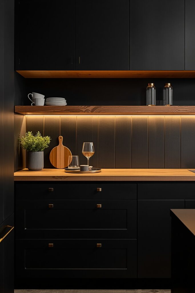
Spray application gives the smoothest matte result; brush-and-roller application can show texture marks in the flat sheen.
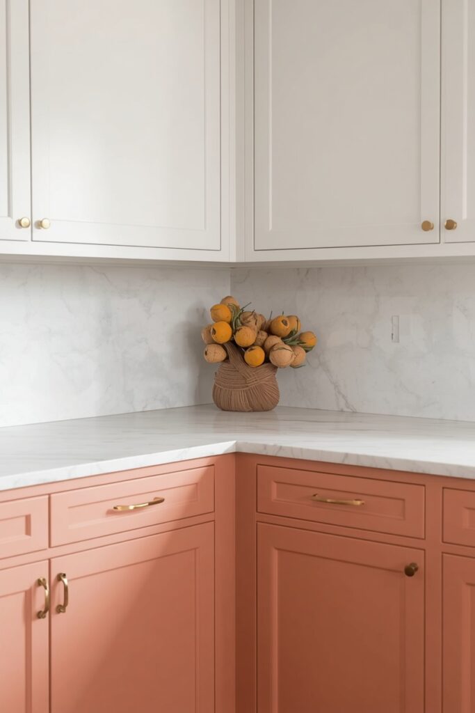
8. Soft Blush Pink for Subtle Warmth
Dusty blush — a muted pink with brown or terracotta undertones — brings subtle warmth to a kitchen without the sweetness of saturated pink. This colour reads as a warm neutral from a distance, revealing its pink quality only up close. Apply on the lower cabinets or the island with warm white uppers, or go all-blush for a fully committed look. Hardware in matte brass or warm gold picks up the pink’s warm undertone; avoid chrome, which cools and clashes. A warm white quartz or honed marble countertop and a simple white backsplash let the blush lead quietly. This is a bold but refined choice that suits anyone tired of the green-navy-gray palette that dominates current kitchen trends. Under 2700K lighting, blush cabinets glow with a warmth that reads as an elevated neutral.
— Choose blush shades with brown or terracotta undertones — avoid blue or lilac-based pinks
— Matte brass or warm gold hardware complements the warm undertone
— Under 2700K lighting, dusty blush reads as a warm neutral rather than a strong pink
Paint Picks: Benjamin Moore Venetian Portico AF-185 • Sherwin-Williams Likeable Sand SW 6058 • Behr Retro Pink S160-2
9. Painted Kitchen Ideas With Brush vs Spray Application
The application method — brush-and-roller versus spray — affects the outcome as much as the colour. Brush-and-roller is the accessible DIY method: a foam roller on flat surfaces gives a smooth, even coat, and a quality angled brush handles the panel edges and details. The result is a subtle texture that reads handmade and suits farmhouse, cottage, and traditional kitchens. Spray application — using a HVLP (high-volume, low-pressure) gun or hiring a professional spray painter — delivers a factory-smooth surface with no brush marks, roller stipple, or texture. The result reads polished and modern, and is the professional standard for contemporary kitchens.
— Foam roller on flat surfaces gives the smoothest brush-and-roller result
— HVLP spray gun delivers a factory-smooth look with zero texture
— Spray application requires full masking — budget an extra half-day for preparation
Spray requires more preparation: masking every surface, appliance, and wall edge to prevent overspray, and working in a well-ventilated area. For most homeowners, the practical path is brush-and-roller for a warm, handcrafted look or professional spray for a showroom-grade result.
10. Forest Green for Natural Depth
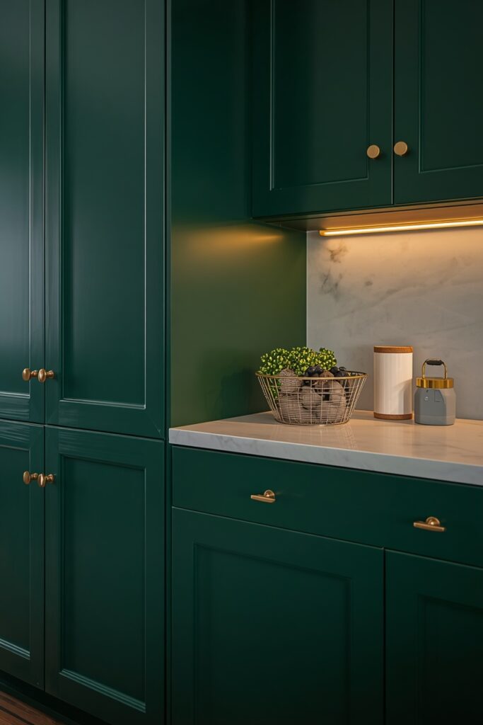
Forest green painted cabinets wrap the kitchen in the richness of a deep woodland — atmospheric without the heaviness of black and more distinctive than the ubiquitous navy. Choose a green with a blue undertone for a cooler, more sophisticated look, or a yellow undertone for a warmer, more inviting feel. Apply on all cabinets for an immersive effect, or on lowers and island with warm white above. Brass hardware is the natural metallic companion — gold against green reads rich and organic. The countertop should contrast: white marble, pale quartz, or light butcher block keeps the upper zone bright.
Under-cabinet lighting is important because dark green absorbs light aggressively. Forest green cabinets hide wear well and photograph dramatically for listing photos. Two coats over a dark-tinted primer ensure even, streak-free coverage.
— Blue-undertone greens read cooler and moodier; yellow-undertone greens glow warmer
— Dark-tinted primer reduces the coats needed for even coverage
— Brass hardware against forest green reads rich and organic — the definitive pairing
Paint Picks: Benjamin Moore Essex Green HC-188 • Sherwin-Williams Rookwood Dark Green SW 2816 • Behr Billiard Green S-H-460
11. Warm Mushroom for a Modern Neutral
Mushroom — a brown-gray blend that borrows warmth from brown and depth from gray — is one of the most versatile painted kitchen colours. It avoids the dated quality of tan, the coldness of gray, and the starkness of white, landing in a sophisticated middle ground. Apply it to all cabinets for a uniform, warm envelope, or pair it with warm white uppers for a lighter top zone.
Hardware in any metal — brass, nickel, chrome, or matte black — coordinates with mushroom, giving you freedom to match existing fixtures. A cream or warm white countertop and a simple subway backsplash let the colour read quietly. Under 2700K lamplight, mushroom walls glow with warmth.
— Choose mushroom with equal gray and brown undertones — avoid shades that lean too yellow
— Mushroom coordinates with every hardware metal — the most flexible neutral
— Under 2700K lamplight, mushroom glows warmly without reading tan or dated
Paint Picks: Benjamin Moore Ashley Gray HC-87 • Sherwin-Williams Mega Greige SW 7031 • Behr Studio Taupe PPU5-07
This is the choice for anyone who wants colour but not boldness — a painted kitchen that reads warm and considered without drawing attention to the paint itself.
12. Contrasting Interior Cabinet Colour
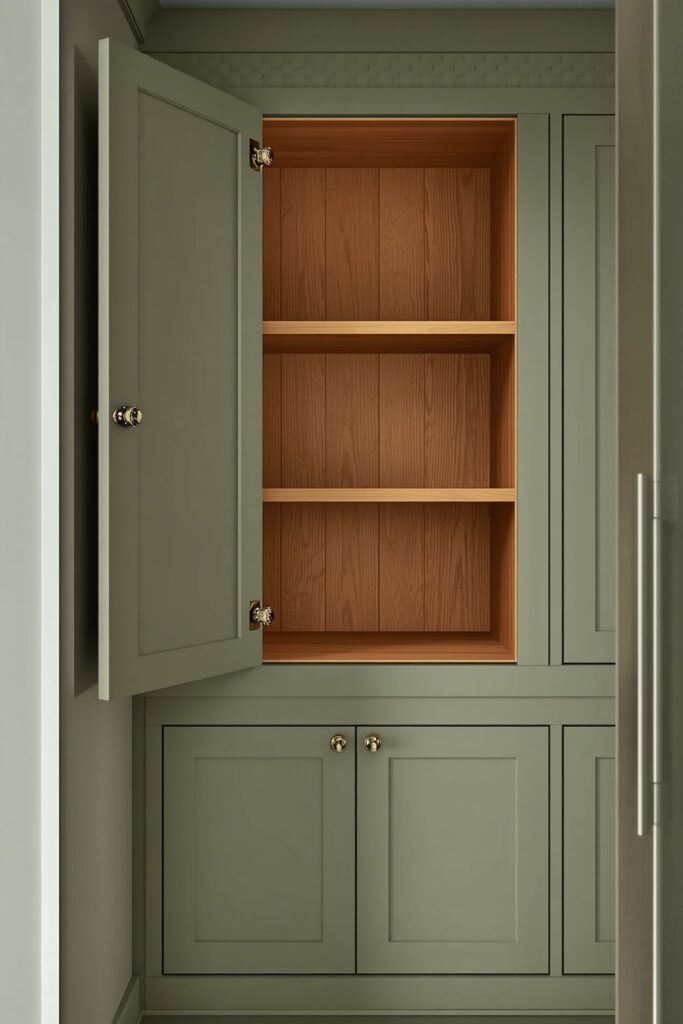
Painting the cabinet exteriors in a solid colour while revealing a contrasting colour inside — the back panel, shelf edges, and drawer interiors — adds a surprise element that guests discover when a door opens. The exterior stays in the room’s main palette (white, sage, navy, charcoal), while the interior gets a bold or warm accent: a warm terracotta, a soft blush, a deep teal, or a natural wood stain left unpainted. The contrast is visible only when the cabinet is open, making it a private design detail that adds richness without affecting the room’s overall colour scheme. This treatment requires either custom specification (telling the painter to mask the interiors before painting) or painting the interiors a different colour after the main paint job. A warm wood interior — natural oak or birch sealed with a clear coat — is the most popular version because it adds organic warmth and material contrast.
— Mask interiors before painting the exterior colour, or paint interiors separately
— Natural wood interiors (oak, birch with clear coat) are the most popular contrast
— The interior colour is a private detail — it can be bolder than anything on the exterior
13. Aged or Distressed Edge Technique
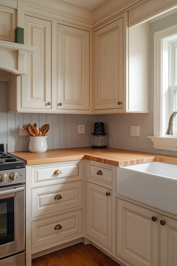
A deliberate distressed edge — where the paint is lightly sanded or worn through at corners, edges, and high-touch areas to reveal the wood or a contrasting undercoat — gives a painted kitchen an aged, antique character that suits farmhouse, cottage, and French country interiors. Start by painting the cabinets in the base colour (cream, pale blue, soft sage, or warm white), then once fully cured, sand the edges, corners, and raised panel details with 120-grit sandpaper to wear through to the wood or primer beneath. Seal the distressed surface with a clear matte wax or polyurethane to protect the exposed areas. This technique reads as naturally worn rather than freshly painted, and it suits kitchens with vintage hardware (ceramic knobs, cup pulls in aged brass) and traditional materials (butcher block, farmhouse sink, open shelving).
The distressing should look random and natural — avoid symmetrical or systematic sanding, which reads fake.
— Sand corners, edges, and raised panel details — the areas where real wear occurs
— Use 120-grit for a gentle reveal; heavier grits remove too much too fast
— Seal with clear matte wax for a soft, aged look; polyurethane for more durability
14. Painted Kitchen Ideas for Renters With Removable Paint
Renters who want to paint their kitchen cabinets without violating the lease can use a removable cabinet paint or a peel-and-stick cabinet wrap. Removable paints (available from specialty brands) apply like standard paint but peel off cleanly when you move out, leaving the original surface underneath. Cabinet wraps — self-adhesive vinyl in matte, gloss, or wood-grain patterns — adhere to flat-panel doors and drawer fronts and remove without residue. Both options require clean, grease-free surfaces for proper adhesion. The removable paint suits shaker and traditional doors with panel details; vinyl wraps suit flat-panel (slab) doors because they cannot conform to raised or recessed panel geometry.
— Removable paint suits panelled doors; vinyl wrap suits flat-panel doors only
— Clean with degreaser before applying — adhesion depends on a grease-free surface
— Swap hardware back to originals when you move out for a clean handback
Pair either treatment with new hardware (which swaps back to the originals when you move) for a complete visual transformation. This approach lets renters enjoy a painted kitchen for the duration of their lease without the anxiety of a security deposit deduction.
Where I’d Start if I Only Did Three Things
If I only did three things, I would start by choosing the paint colour and buying a sample pot — paint a 30 × 30 cm swatch on the inside of one cabinet door and live with it for 48 hours under both daylight and evening lighting before committing. Second, I would invest the full preparation time: degrease, sand, prime with a bonding primer, and allow each coat to dry fully — cutting corners on prep is where most painted kitchens fail. Third, I would swap the hardware at the same time as the paint, because new pulls in a coordinated metal complete the transformation and make the whole project read as a planned renovation rather than a paint job.
Frequently Asked Questions
What painted kitchen ideas give the most professional result?
Spray application over a bonding primer and two coats of cabinet-grade paint in a semi-gloss sheen gives the most factory-smooth, professional result. For brush-and-roller application, use a foam roller on flat surfaces and a quality angled brush for edges, and allow full cure time (7–14 days) before rehanging doors and loading with heavy items.
How long does a painted kitchen last?
A properly prepared and painted kitchen — degreased, sanded, primed with bonding primer, and topcoated with a cabinet-grade semi-gloss — lasts 7 to 10 years before needing a refresh. High-touch areas (around handles, near the stove) may need touch-ups after 3 to 5 years. Low-quality paint or skipped preparation reduces the lifespan significantly.
What is the best paint for kitchen cabinets?
A cabinet-grade acrylic alkyd or hybrid alkyd paint in a semi-gloss or satin sheen provides the best combination of durability, adhesion, and cleanability. Brands like Benjamin Moore Advance, Sherwin-Williams Emerald Urethane, and Behr Alkyd Semi-Gloss are specifically formulated for cabinetry and withstand the daily grease, moisture, and handling that kitchen surfaces endure.
Can I paint kitchen cabinets without sanding?
A bonding primer specifically designed for glossy surfaces (like Zinsser BIN or KILZ Adhesion) allows you to skip heavy sanding — a light scuff with a fine sanding pad is still recommended for best adhesion. Skipping both sanding and primer is the most common cause of paint peeling on kitchen cabinets within the first year.
Final Thoughts
The strongest painted kitchen ideas commit to preparation as seriously as they commit to colour. Choose a shade with the right undertone for your lighting, invest the full prep time (degrease, sand, prime, two topcoats), and swap the hardware simultaneously so the entire transformation reads as a planned renovation. A properly painted kitchen costs a fraction of new cabinetry and delivers a visual result that rivals it.